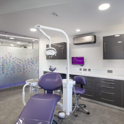
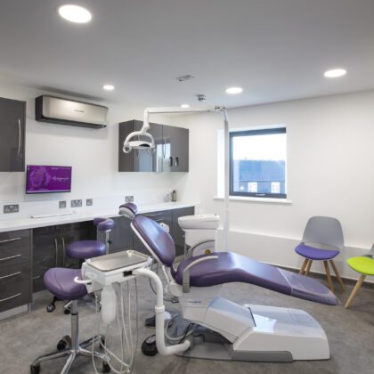
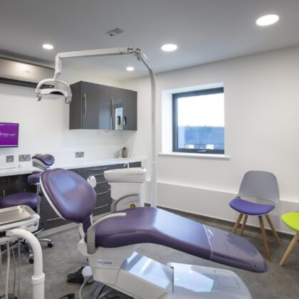
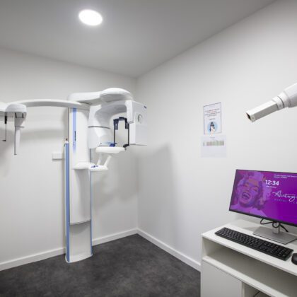
Project Overview
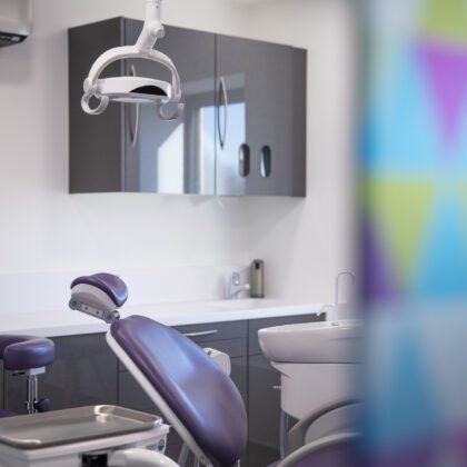
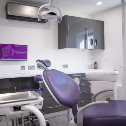
4-Surgery practice
Interior concept: Modern
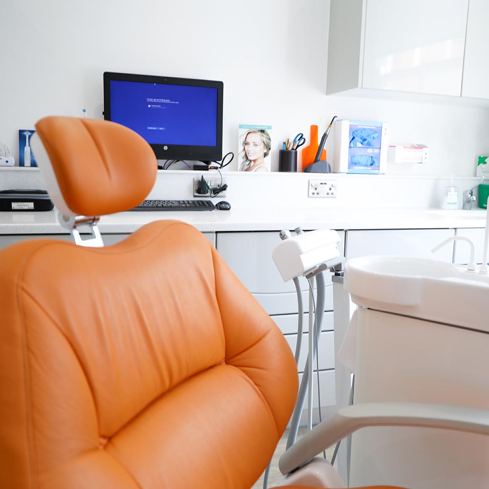
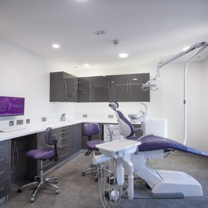
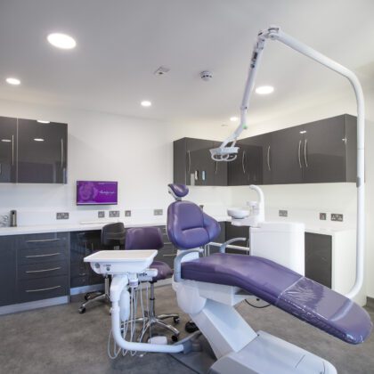
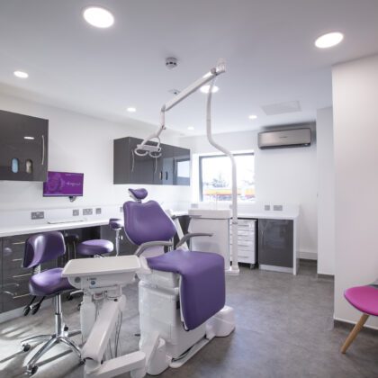
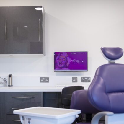
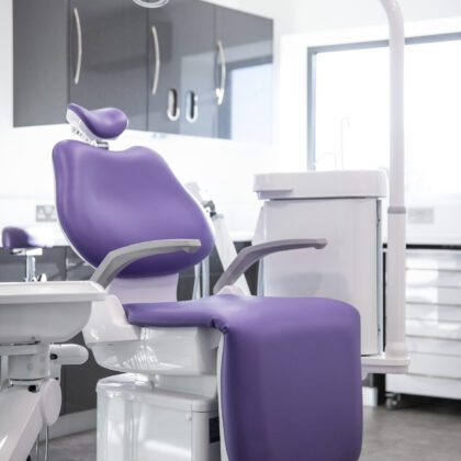
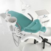
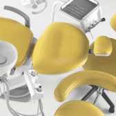
Belmont chair packages
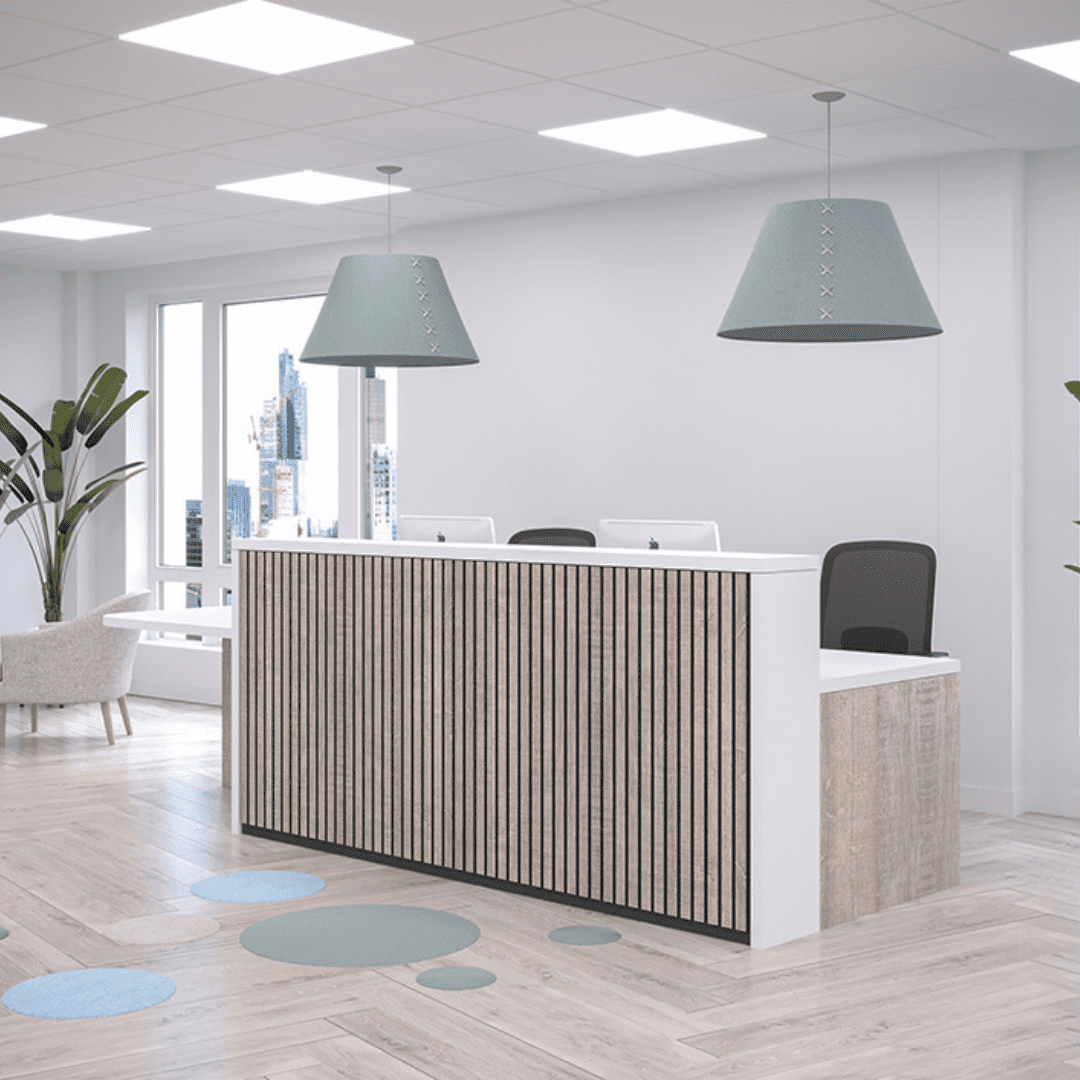
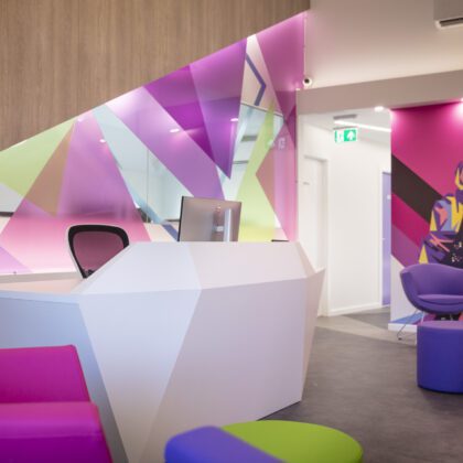
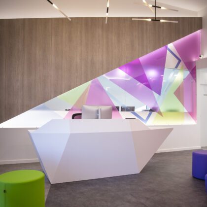
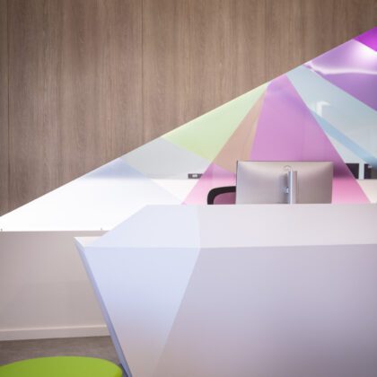
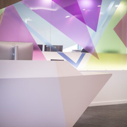
Bespoke reception desk
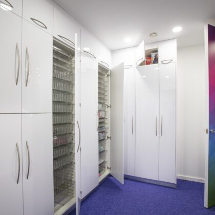
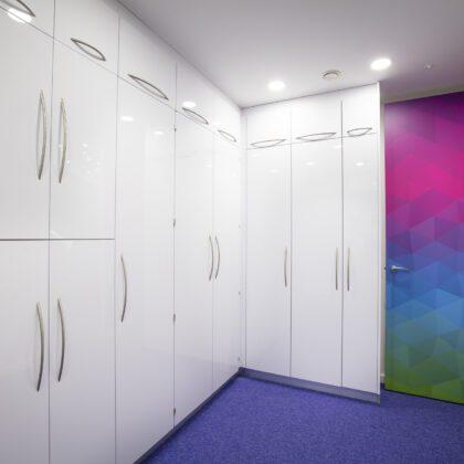
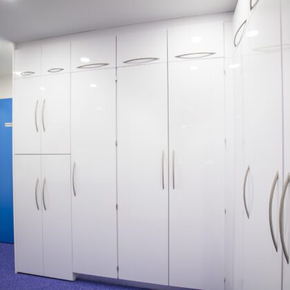
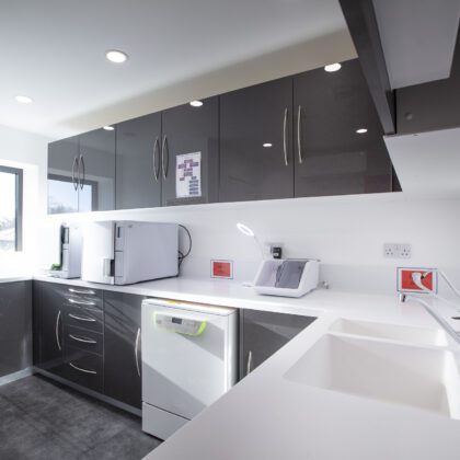
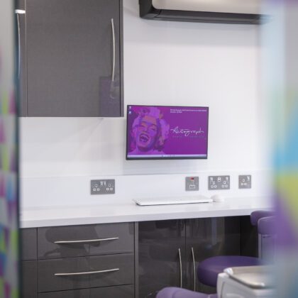
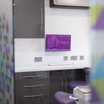
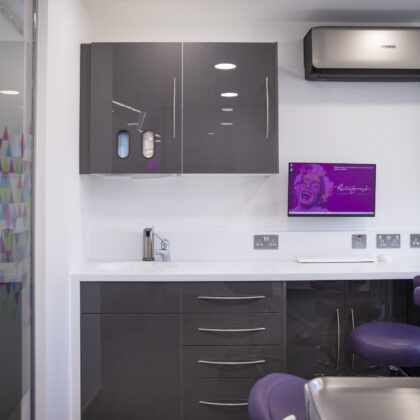
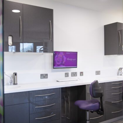
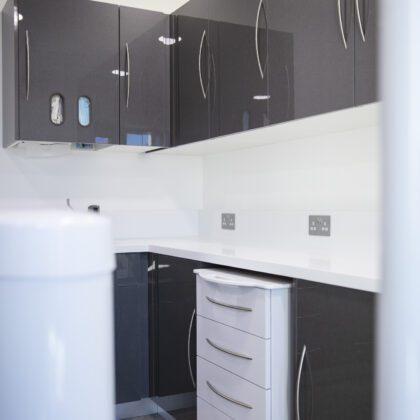
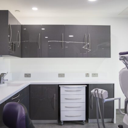
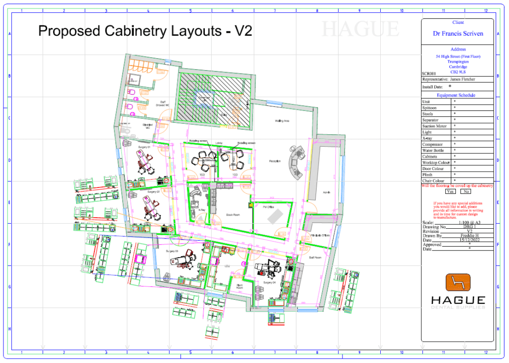
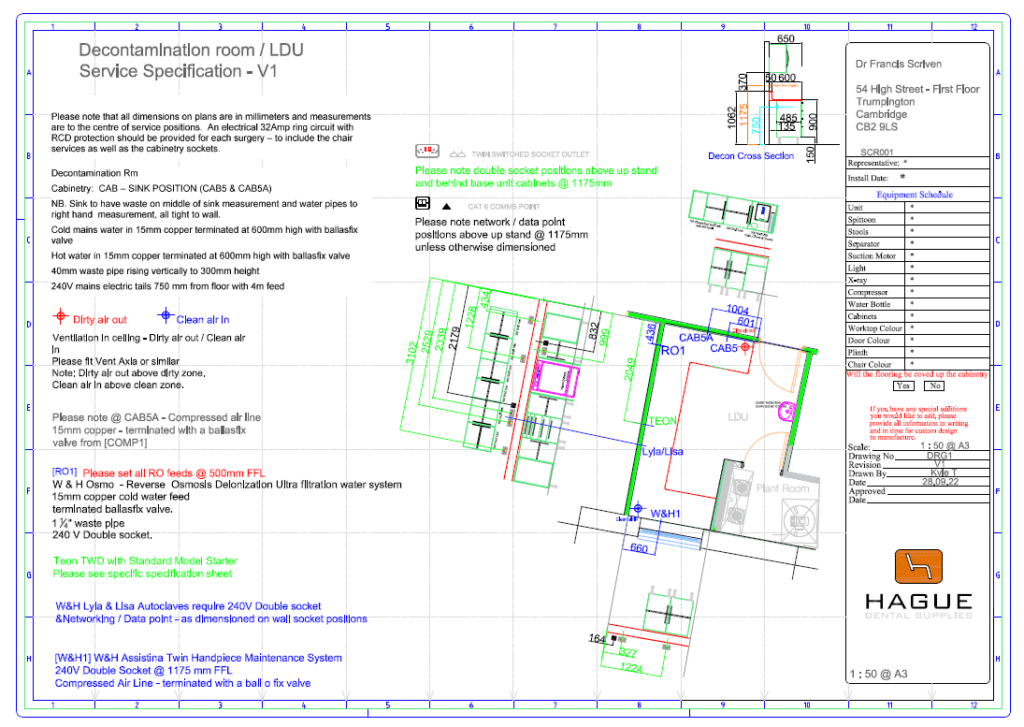
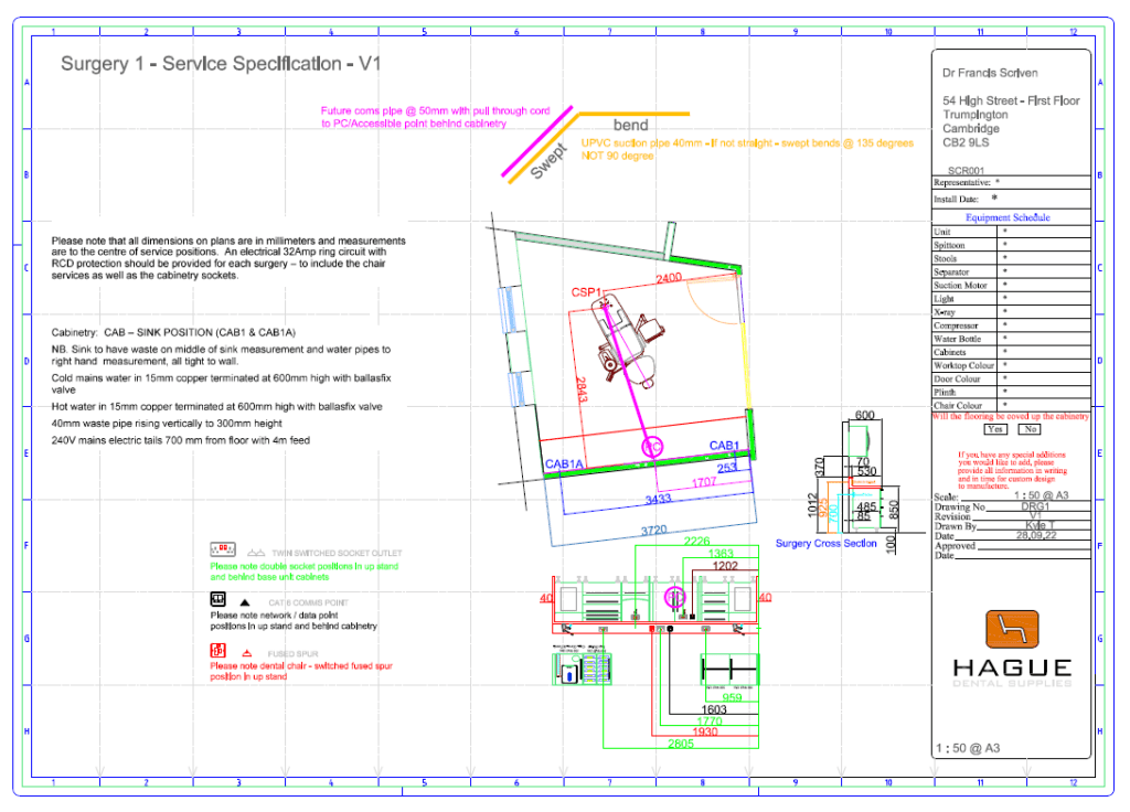
Bespoke cabinetry
Project Management
Planning our Squat
I’ve worked as Practice Manager alongside Dr. Francis Scriven at Anglia Orthodontics for a very long time. I retired in January 2022 and then in March 2022 he contacted me and asked if I would help him to set up a squat practice as the current practice was at capacity which restricted further growth.
One of the first things on our to-do list was to secure the dental chair packages as we initially planned to open on the 1st of November 2022 and we knew there were long lead times. I found Hague via an asset finance group and contacted James (Sales Manager). Hague was the only company that could supply the dental chairs that we wanted as they pre-buy and keep Belmont stock. James invited us to visit the showroom, he was welcoming and informative. It was great to see all the chairs and dental cabinetry.
Chair Package selection
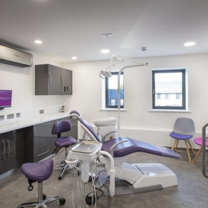
James gave us all the time we needed to try out the various chair packages. We planned to have four surgeries and we wanted a selection of chairs – knee-break, ambidextrous, etc. We had Belmont at the other practice and we love the quality.
The Project
Initially, we started the project planning phase with a different dental practice design company and an independent Interior Designer. This design company manufactures its own bespoke furniture and had worked with our builders before. When we visited the Hague showroom we absolutely loved the bespoke furniture and medical-grade cabinetry on show. James was familiar with our appointed design company and told me we were in good hands. At that stage, we had 2D drawings and Service Specifications and we were ready to continue with them. It was at this late stage, prior to the build, that we decided that we needed a different designer. Our build team also had a young designer that works with them which we considered, but I just didn’t feel she had the depth of experience. We decided to switch to the support that Hague could give us.
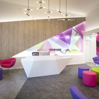
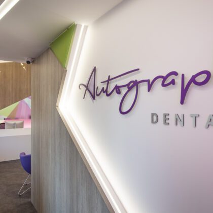
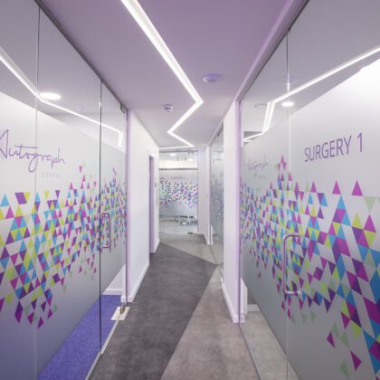
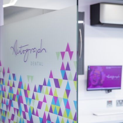
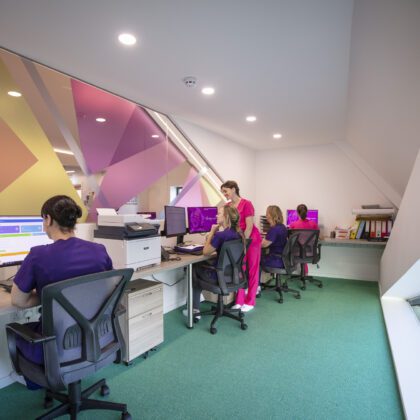
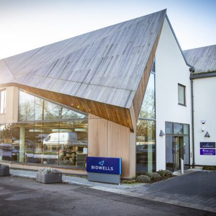
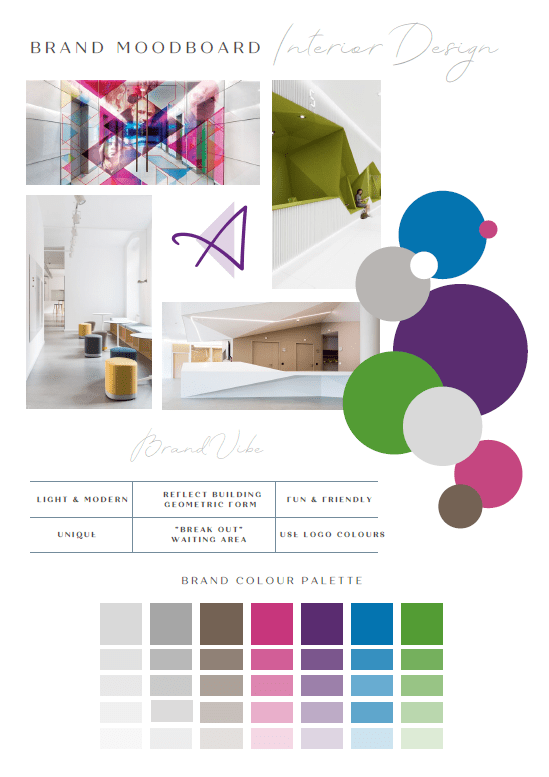
Jumping ship did pose us with problems, as Kirsty (Interior Director at Hague) joined the project just as we signed the lease and the builders commenced work in mid-September. That’s where the project became a bit complicated because it did mean at that stage that we didn’t have project management continuation. Hague had to pick up a lot of things quickly such as the service specifications and various design specifications. Kirsty came on board very, very quickly, and from the moment I met her, I just felt that she listened to the brief and listened throughout the project. She swiftly came up with an amazing concept utilising the quirky shape and fabric of the external and internal building, together with the branding colours. It was a tall order as the builders were progressing fast and we were only just commencing with Kirsty and her team; James, Darren, and Jason, but I felt supported and guided by them at all times. The wonderful “thing” about Kirsty is Autograph Dental’s design is original and not just another Kirsty Interior, she can think outside the box and listen to the client and the space, which we had lacked confidence in with the previous designer.
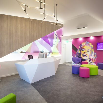
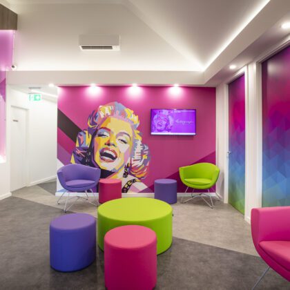
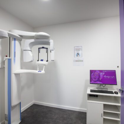
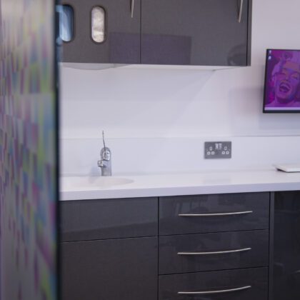
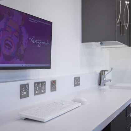
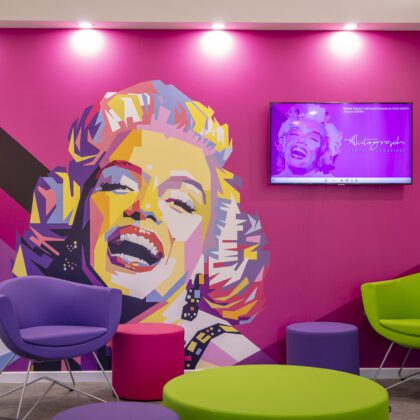
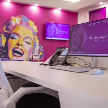
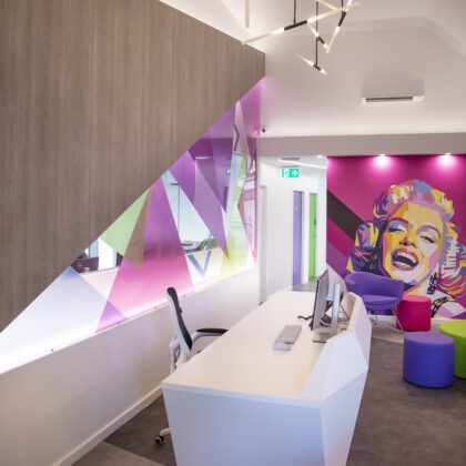
Francis wanted pop art within his brief; Kirsty found the Marilyn Monroe mural for him – and it works and is stunning. Personally, I wanted Audrey Hepburn in a similar style but due to the nature of projects you very quickly go down a direction, and then there’s no pulling back and you must see it through.
Branding
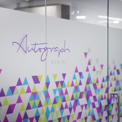
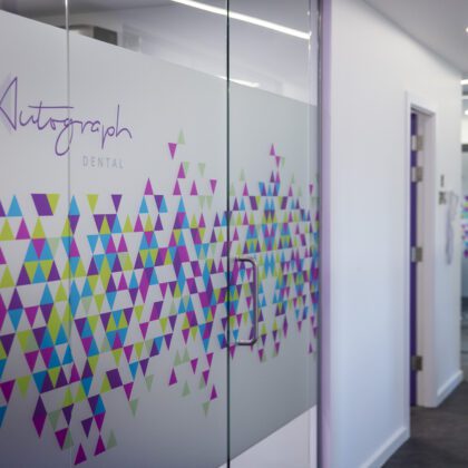
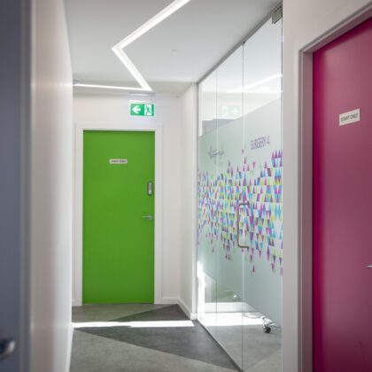
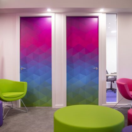
We approached a branding company early on and we had several name concepts and options. We finally settled on the name ‘Autograph’ due to the analogy of autographs and smiles being individual to the customers – we provided guidelines on the colour palette – we wanted a royal purple and grey. We introduced other colours to have branches of our services; green for orthodontics, children’s dentistry in pink, and aesthetics in blue.
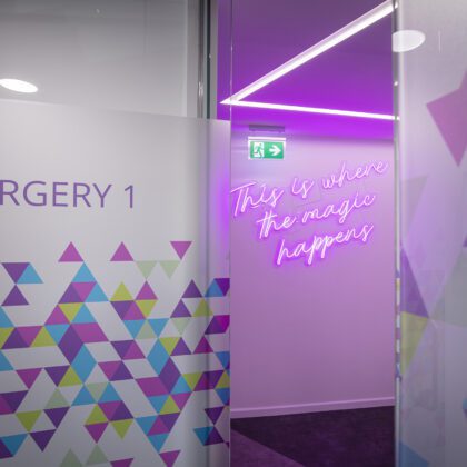
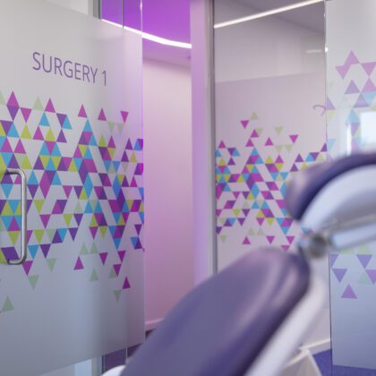
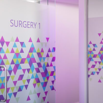
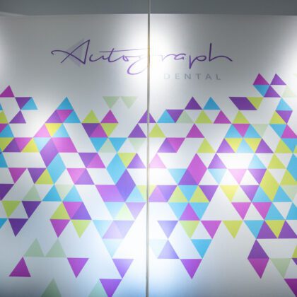
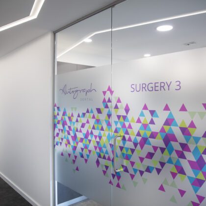
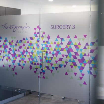
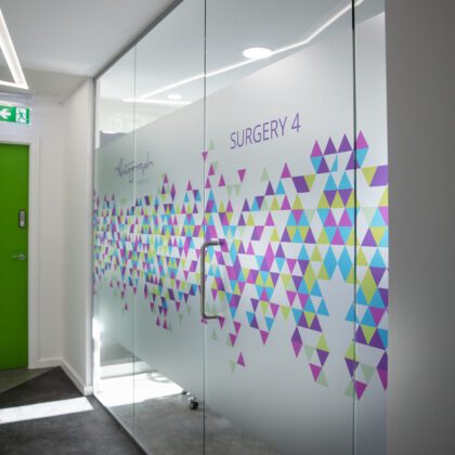
As soon as Kirsty came up with initial plans she met with Francis on-site. So the brief was really quite fluid and we relied on Kirsty’s creativity, which is fantastic. From the manifestations on the glass and everything else she choose, she managed to make it flamboyant, but also very sophisticated which I think is very clever.
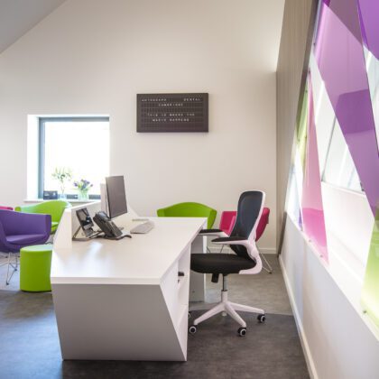
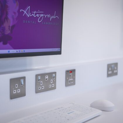
We definitely wanted to keep the high ceilings in the waiting area and the big window in reception and it was really important that we maximise the natural light and that’s why we kept the surgeries on the outside and offices in the middle. We are also offering children’s dentistry so we wanted bright colours and size-appropriate chairs and lots of USB points to recharge mobile phones – coupled with a bold design.
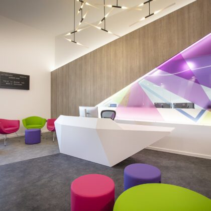
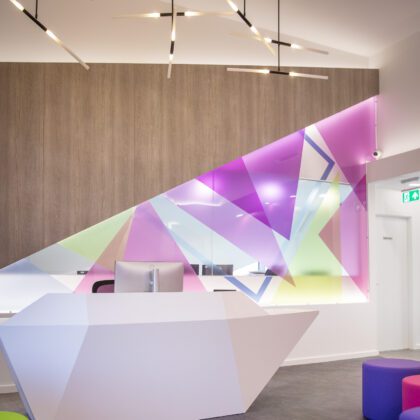
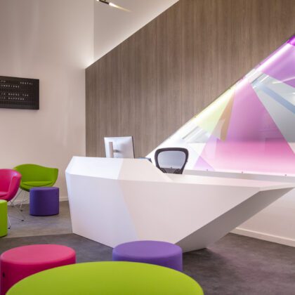
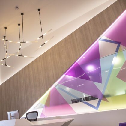
The acrylic wall behind the reception desk is one of my favourite elements of the interior design. Kirsty and her signage supplier worked hard to make it come into reality – build teams can sometimes be skeptical to implement unusual design ideas so there was a balancing act between getting what we wanted creatively and stretching the build team to implement it.
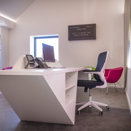
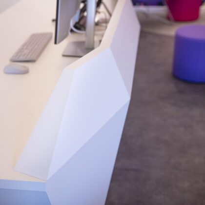
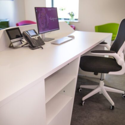
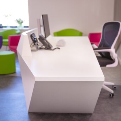
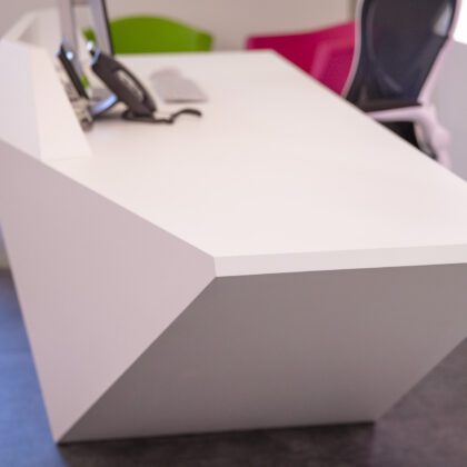
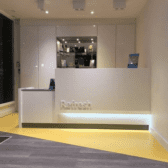
The bespoke reception desk from Clarke Rendall is a great feature for the practice and a stunning design – a lot of discussions went into the design and measurements and in hindsight, we should have put more importance on practicality, and if I had to redesign it again I would definitely have it made in Corian even though it costs substantially more.
Project Management
Hague provided project management for the equipment and cabinetry installation and interior design. For various reasons, whether it be practical reasons or design reasons, or keeping to branding, etc., I did feel I needed to be heavily involved. And that also extended to managing our own build team. A project of this nature is extremely stressful and there were instances when dealing with service providers (and their affiliates) that were frustrating and where I had to micro-manage the process.
Customer and Staff Feedback
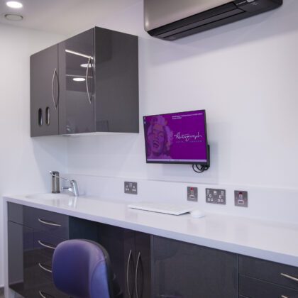
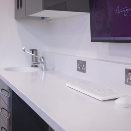
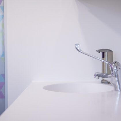
Our customers love the new practice – they walk in and go ‘oh wow’. I think because it’s a cool quiet space. And the staff loves all the equipment, especially the various Belmont chair packages and the bespoke medical-grade cabinetry. The cabinetry looks fantastic – it’s well laid out, works well ergonomically, and the installation went smoothly.
Top Tips
This project was a learning curve – if I had to do it again I definitely wouldn’t swap suppliers midway, but I am 100% sure we made the right decision in doing so.
The pace of a project of this nature is very fast and therefore you must make quick decisions. You can’t procrastinate, you have to make a decision and stand by it.
Budgeting – take control of the budget early on. It’s easy to run over budget if, for example, you don’t know how expensive some of the bespoke elements will be so I would recommend that you get your Interior Designer involved right from the start. Most people setting up a squat would probably not be 100% up to speed with the potential complexity of their entire project and there are all sorts of larger and smaller expenses that pop up that you didn’t plan for.
In closing, I want to say thank you to Hague – I didn’t know about Hague’s existence until we started looking for chair packages and now I only speak highly of your company. So when I talk to people in the industry, I will be singing your praises.
