Project Overview
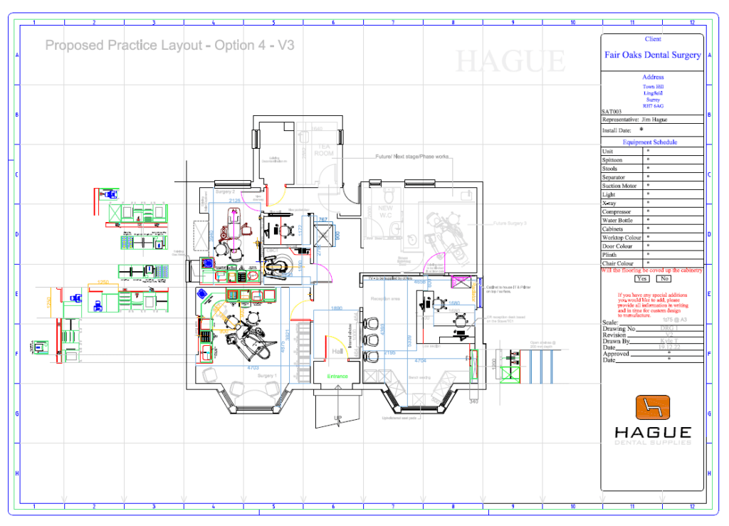
2-Surgery practice
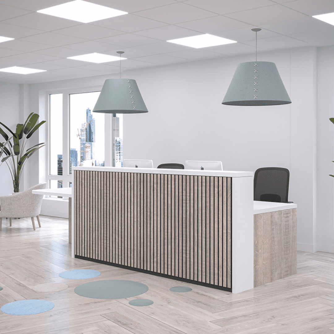
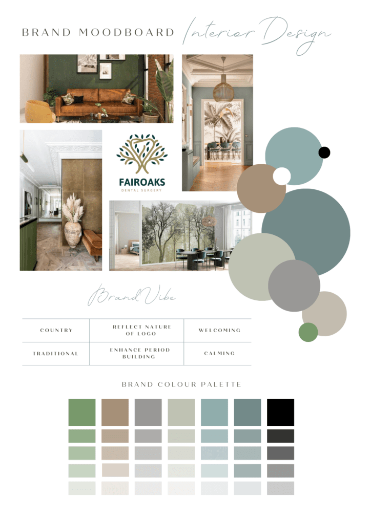
Interior concept: Classic Modern
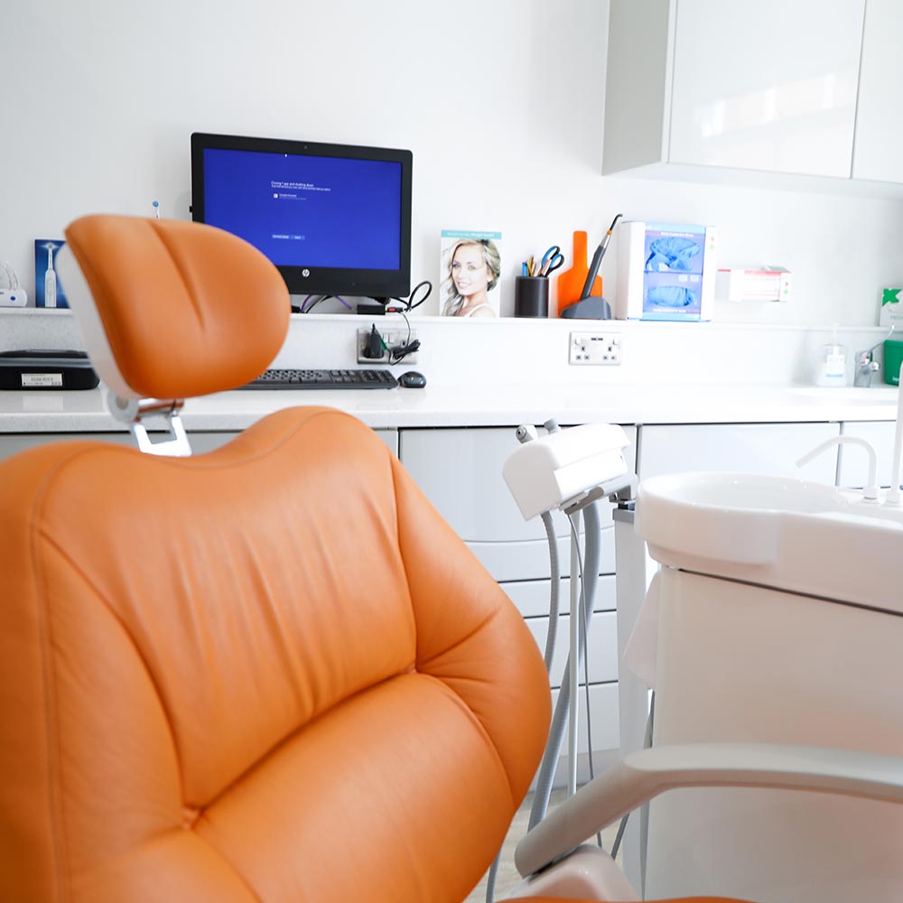
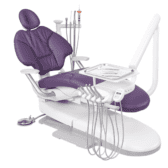
A-dec chair package
Belmont chair package
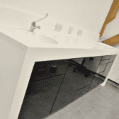
Bespoke cabinetry
Project Management
Hague was a company that was recommended by colleagues and friends as a company that are well known for high-quality results. If you ask most dentists who they would recommend for a practice refurb or surgery fit-out, Hague’s at the top of that list so that’s how I got to know the company.
What really sealed it for us was when Jim invited me to come and have a look around the showroom near Gatwick. He took me around all the different zones and showed us how it all works together; from the warehouse, the engineers’ quarters, and to the design area.
I visited the showroom a couple of times. Visiting the showroom is beneficial as you see what your practice or surgery could look like. For me personally, I’m a novice starting out on my own, the kind of experience and guidance that Jim (Sales Director) and Kirsty (Interiors Director) gave us was invaluable and we really leaned on them for the best outcome.
At the time that I contacted Jim, we were still in the process of securing the site. Jim was kind enough to come out to survey the site and building.
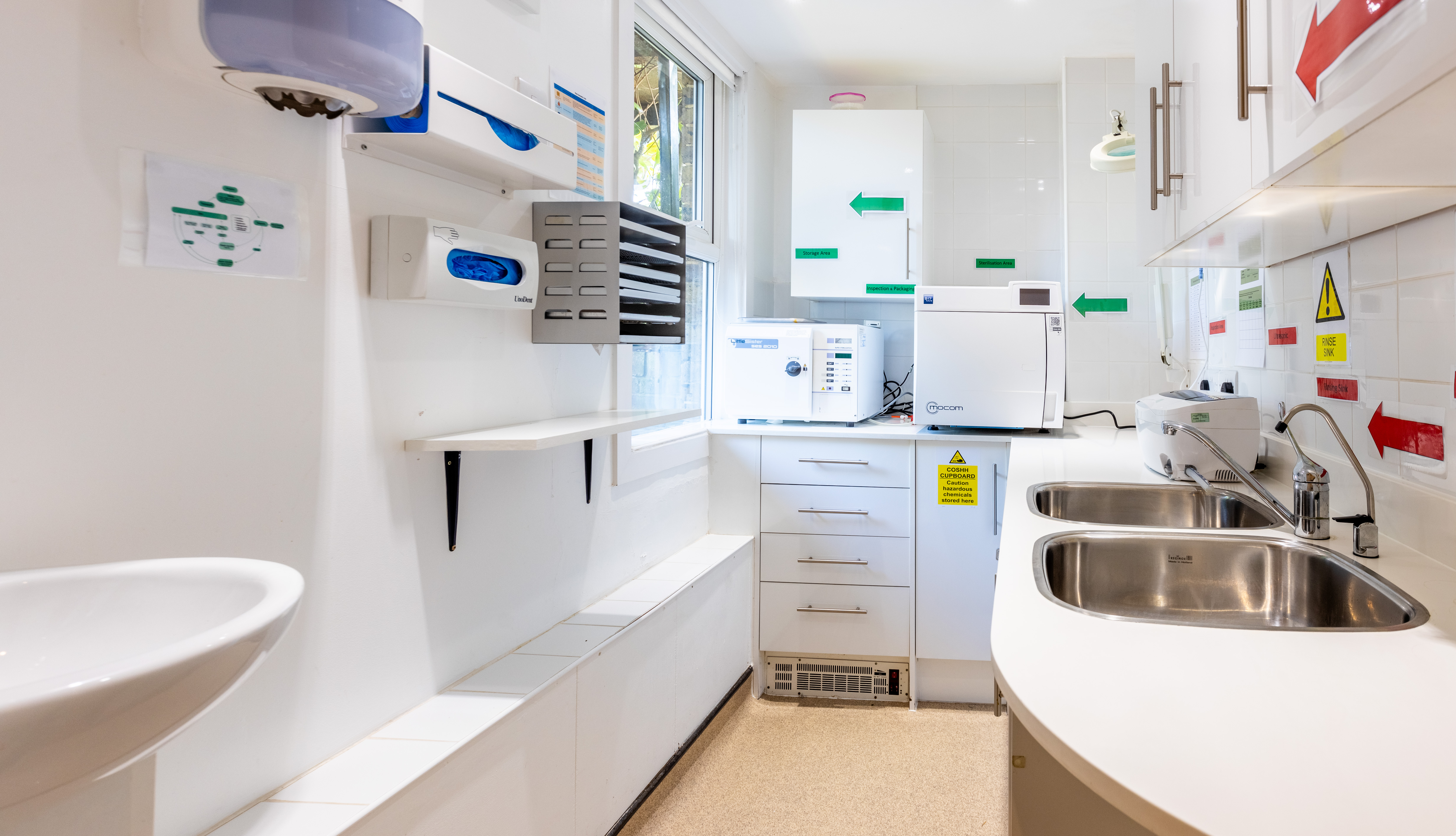
It was an existing dental practice before and had been there for around 50+ years – sadly the previous owner passed away and the practice had been dormant for about 2 ½ years. Jim helped us to go through the equipment inventory to see what could be reused and what needed to be scrapped.
We had to get the practice registered with the CQC (Care Quality Commission) and Jim was able to give us some pointers as to what would definitely be needed.
I initially only wanted to revamp just one surgery. And we planned to spruce up the reception area ourselves just to get it up and running. Jim gave us varied options as well as an option that included refurbing the two surgeries and the reception area.
It soon became clear that projects such as these can be complicated to do yourself – you need someone with experience because it’s so easy to make mistakes. And if it’s the same team that’s project managing as well, that takes a lot of stress off you.
At the time it was quite stressful as I work in other practices full-time and have a young family. Having Darren (Project Manager) handle all aspects of the project management was invaluable. He’ll testify that I texted him all hours of the day with random requests and he always replied.
Ergonomics
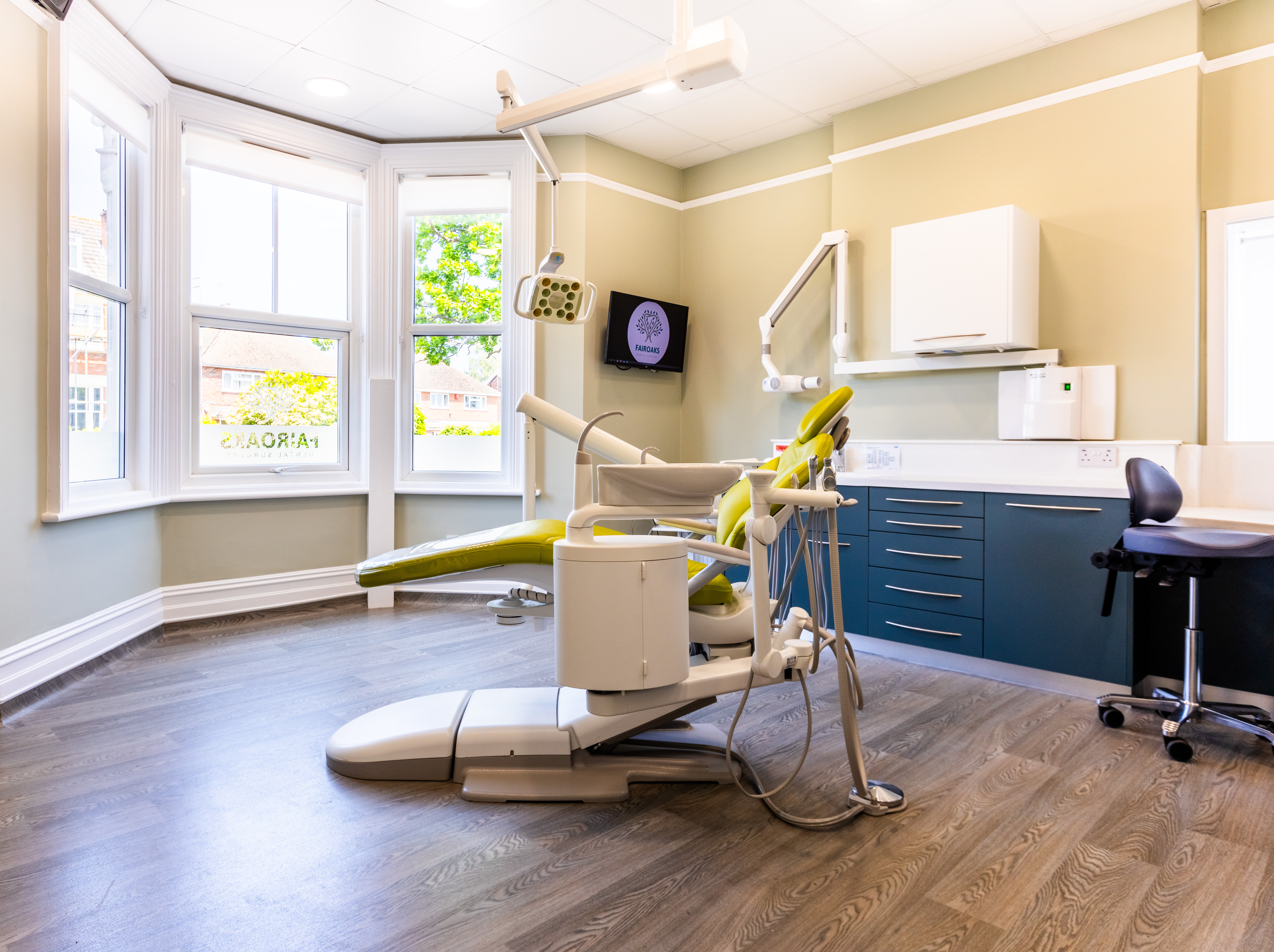
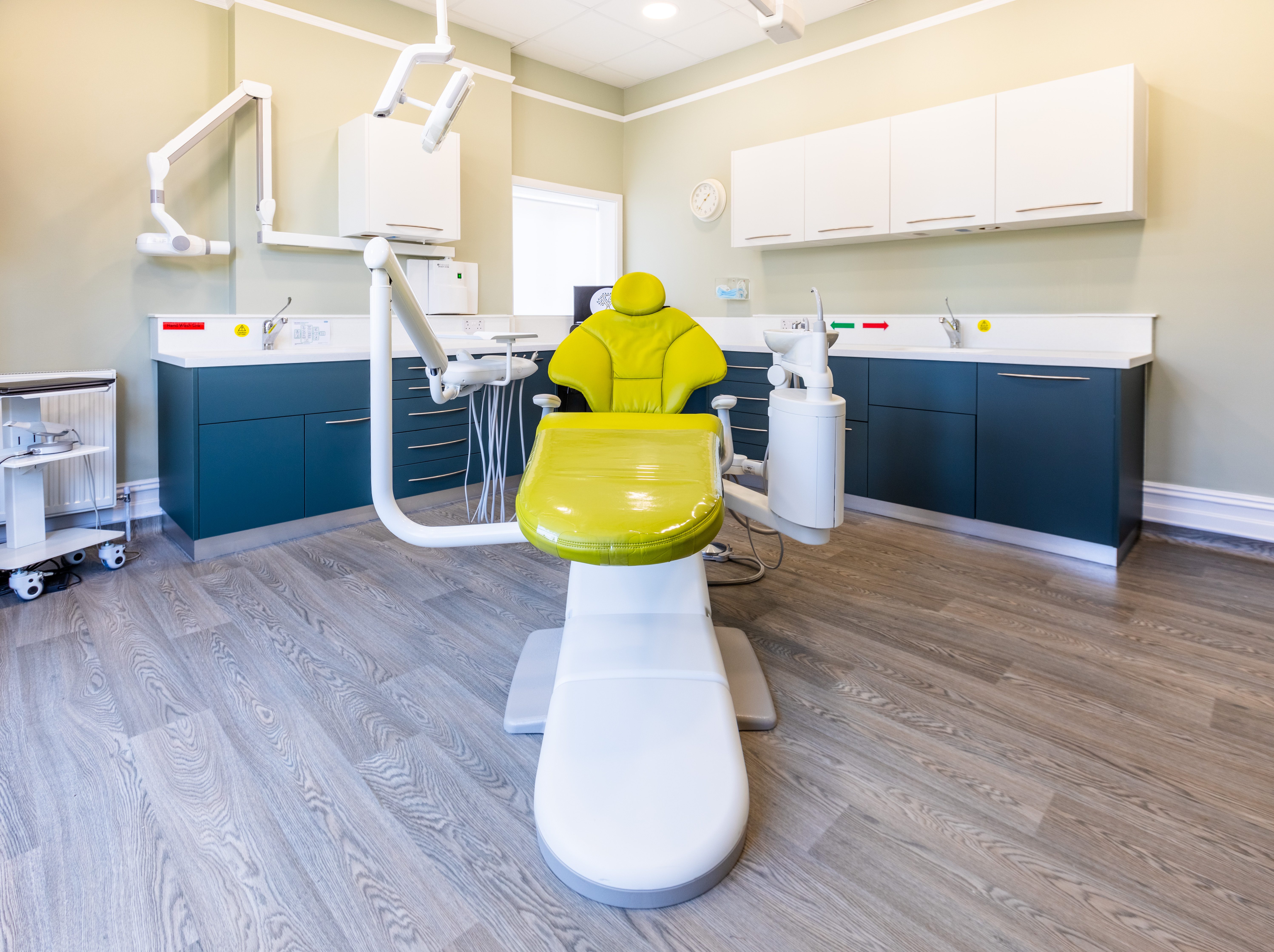
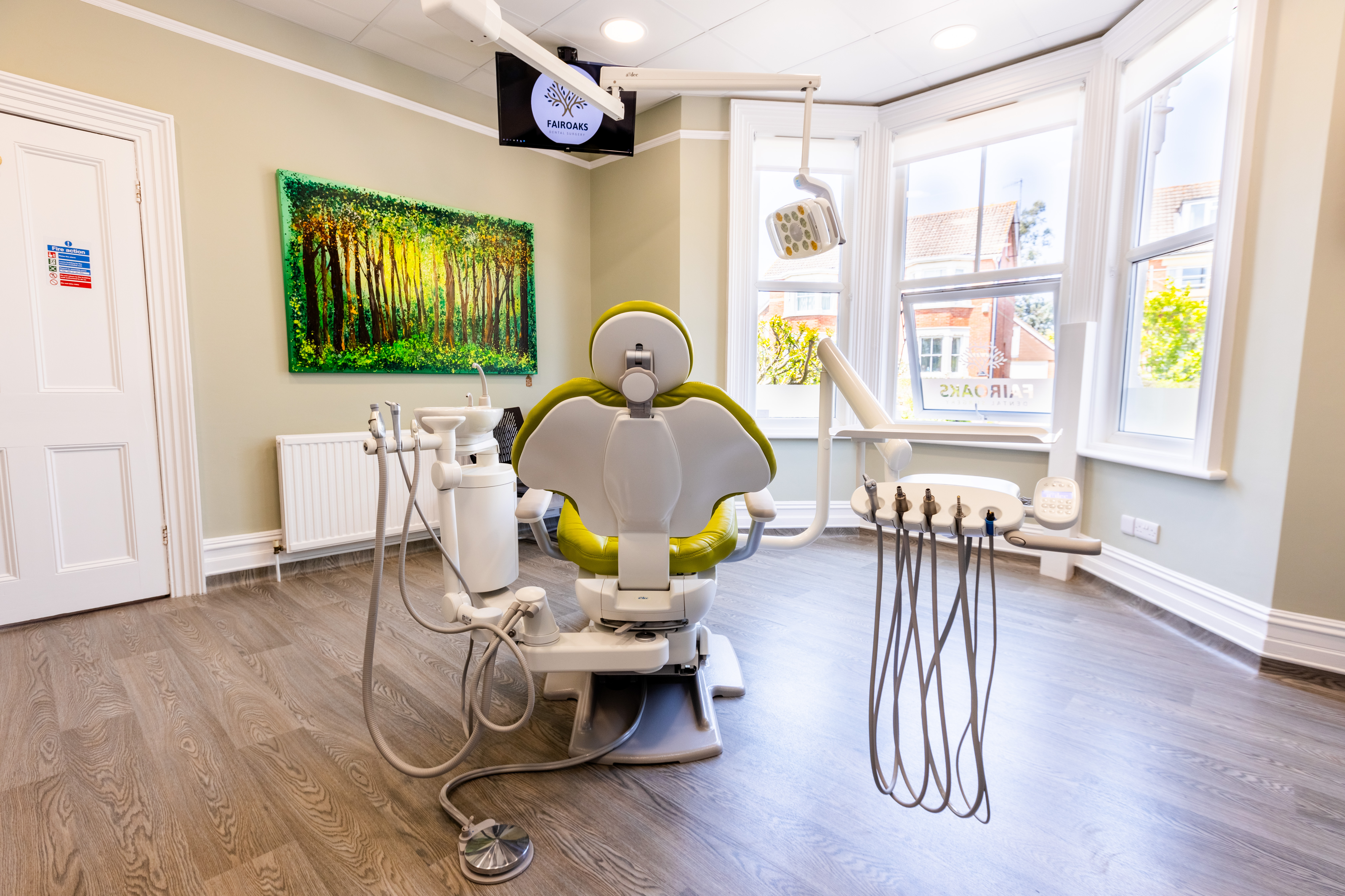
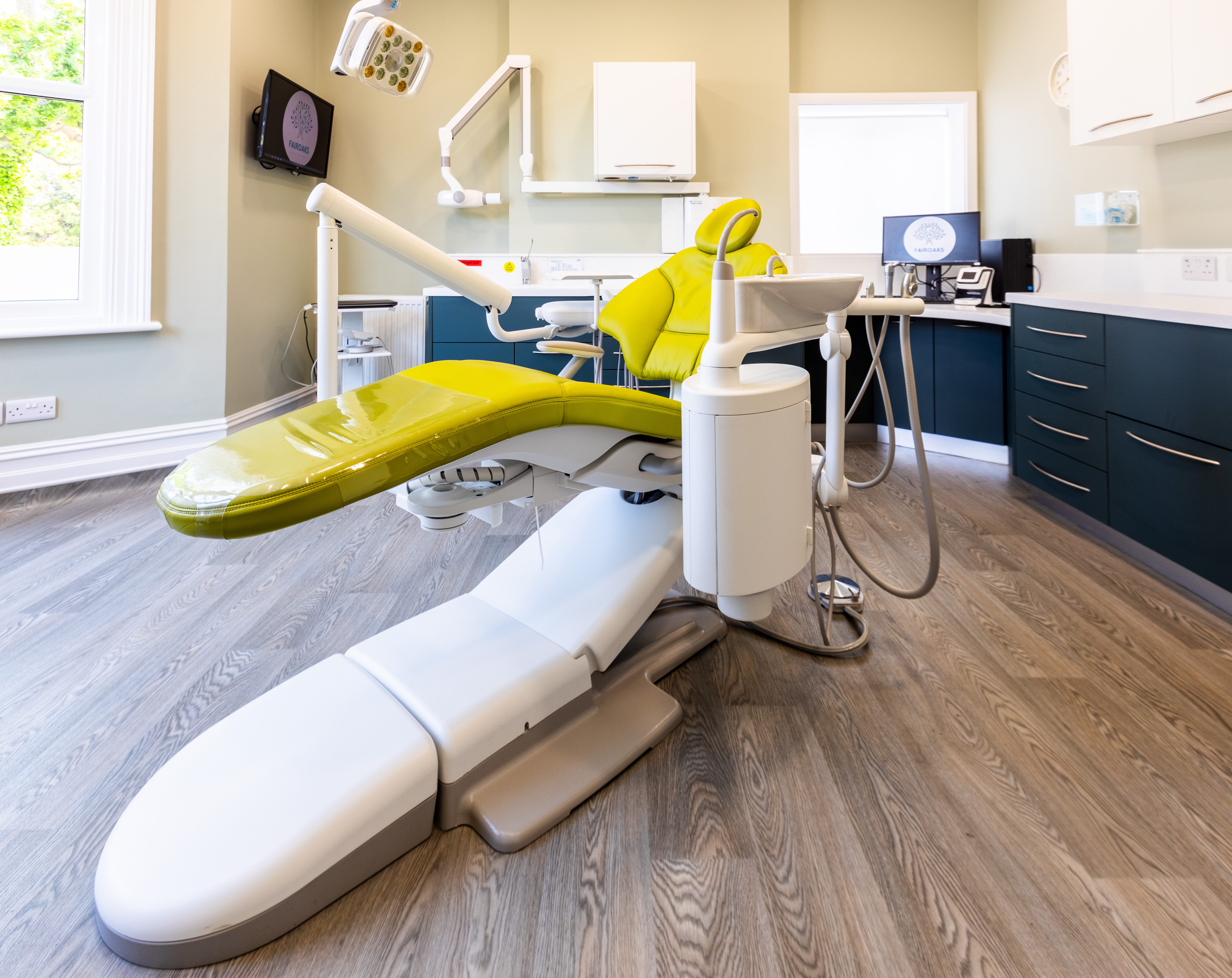
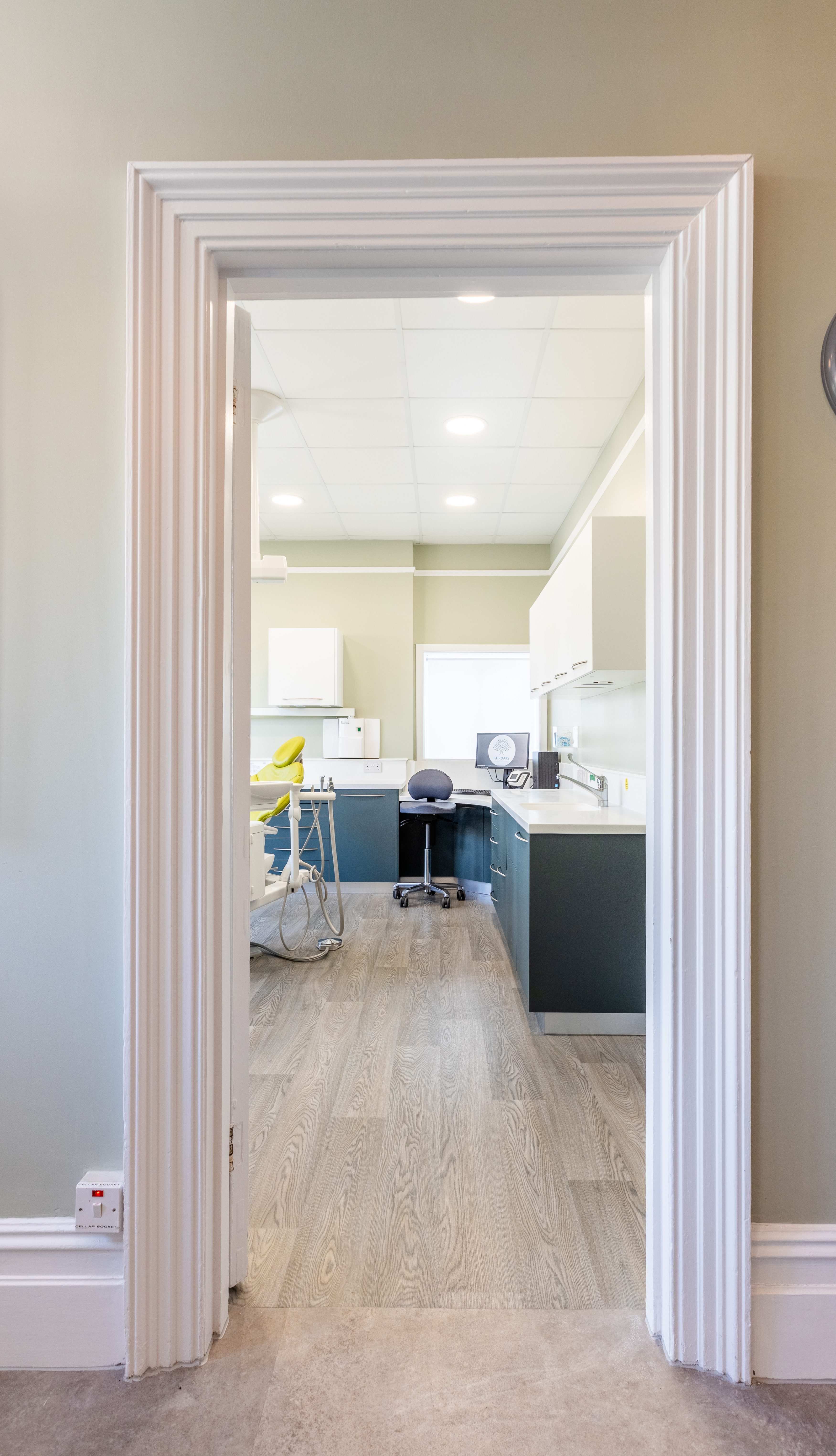
The surgery before was more like a cockpit-style surgery and very dated. The main surgery is a very big room and it’s great as I have space to move around and there are no obstructions in the way. Even though the room is very spacious, everything is still within arm’s reach. It’s still ergonomic in the sense that I’m not having to move around much to get to everything.
There’s enough space for my nurse to be next to me and we’re not treading on each other.
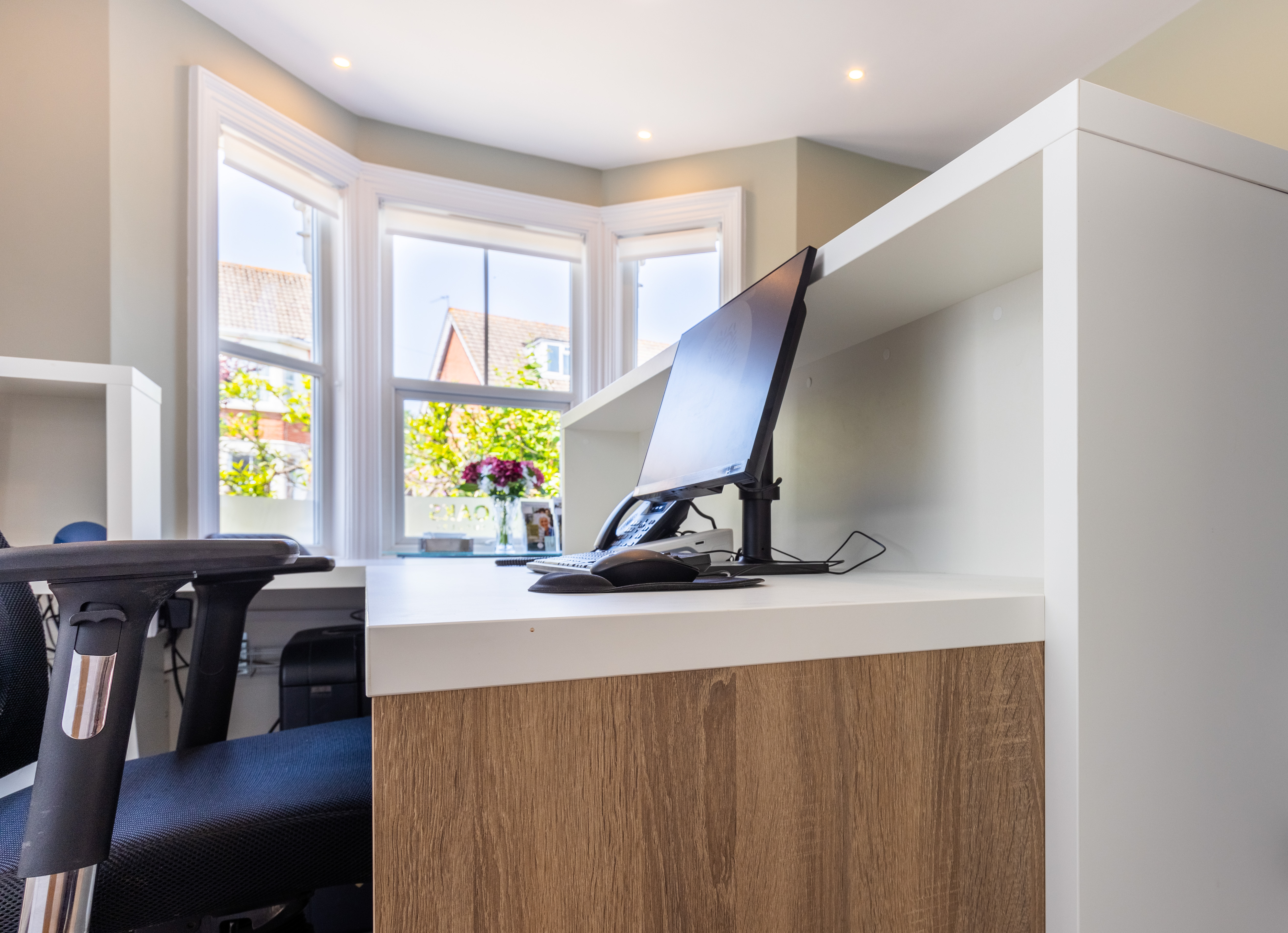
I really wanted to get my computer workstation as ergonomic as possible; I have a bad back and posture is an issue. I’ve worked in surgeries where there wasn’t any legroom for you when you were working on the computer, so I wanted to make sure that all was properly designed and accounted for. From the initial layout suggested by Hague, we agreed to increase the size of the workstation a little more, and it works well – I’m not in the way of the nurse when she’s tidying and completing her tasks.
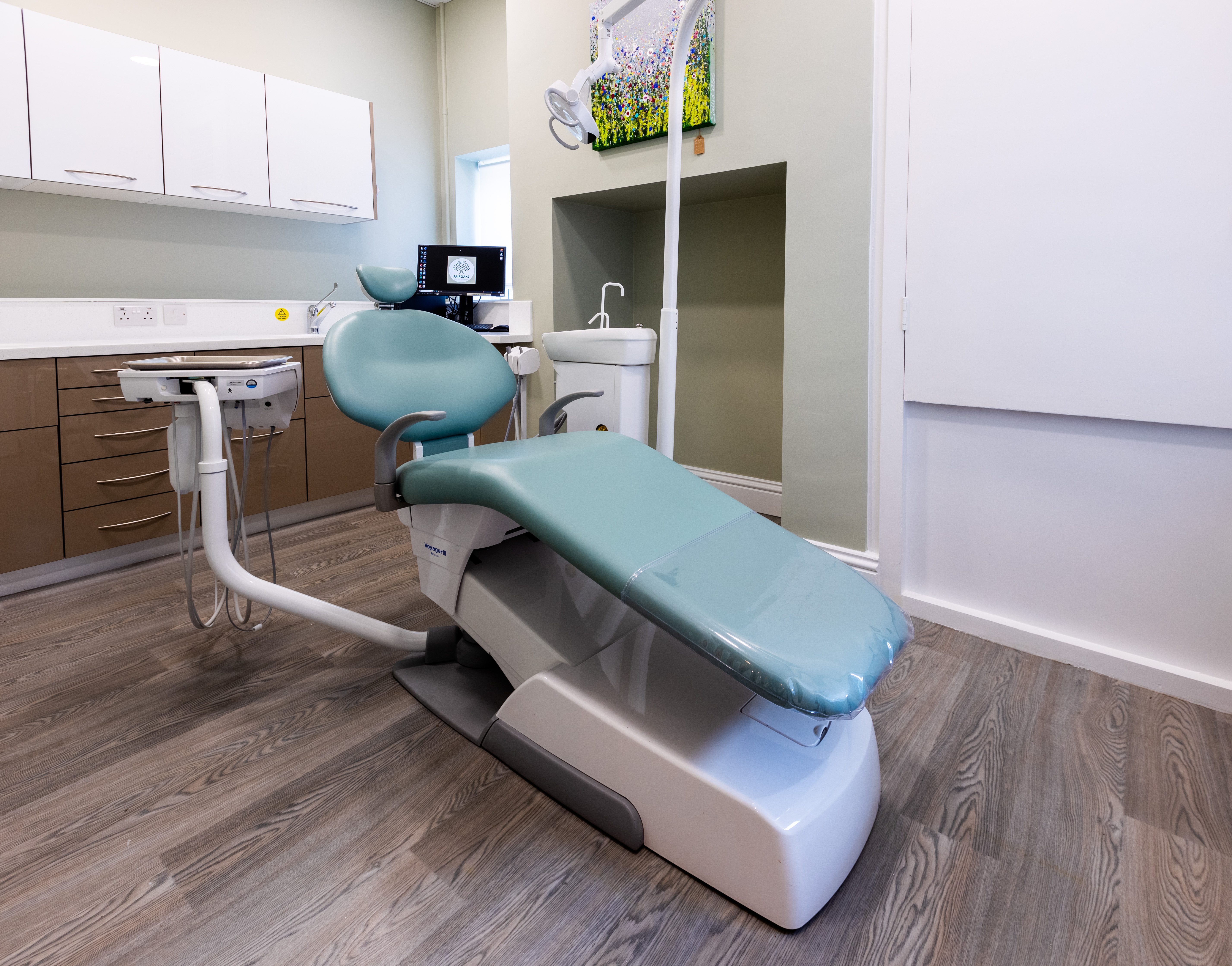
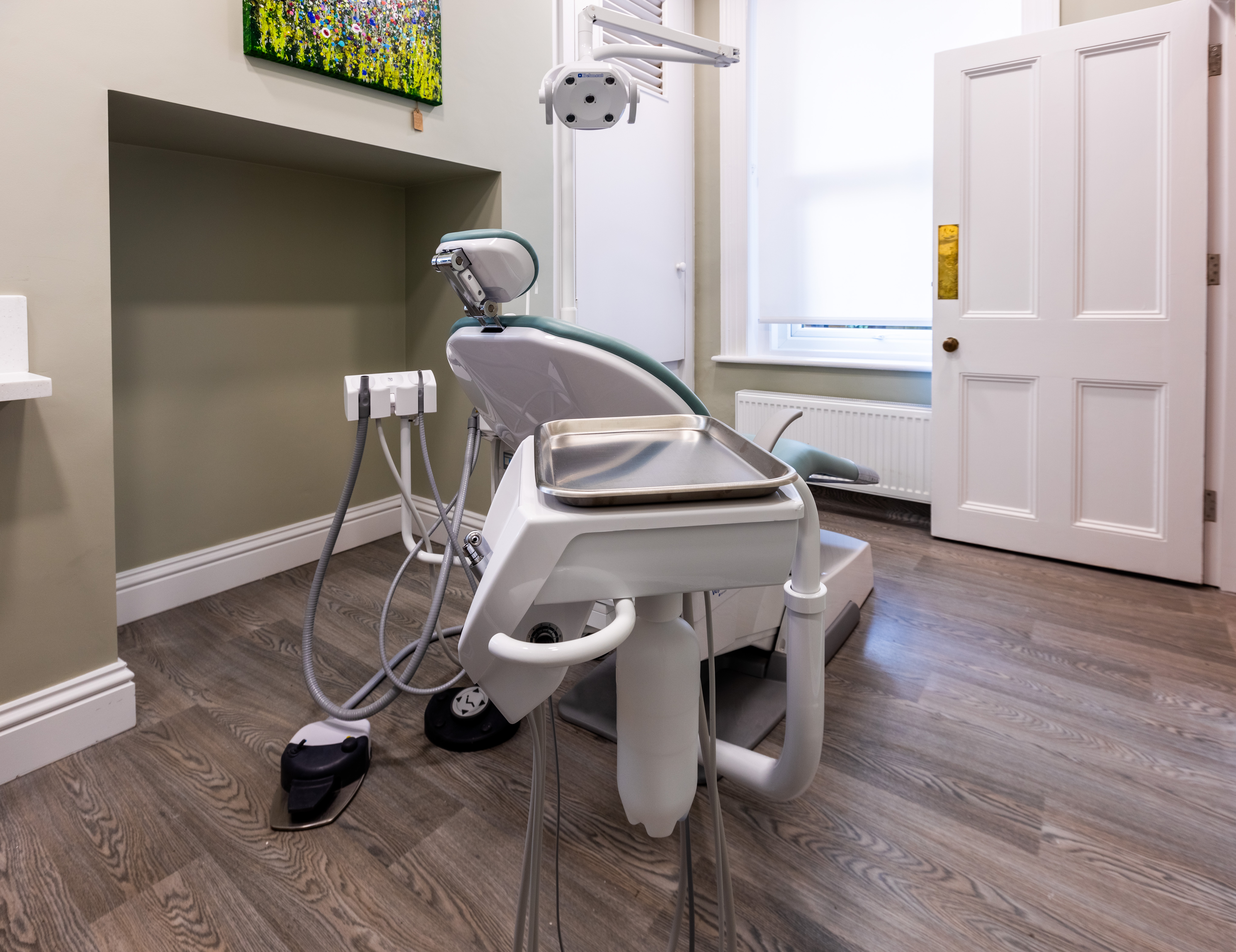
Surgery 2 by comparison is quite a small surgery and odd-shaped room and it houses the gas meter. Getting to the meter was difficult and it reduced storage, but Hague’s cabinetry company tweaked the designs, and we now have easy access to the meter.
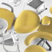
Hague’s engineer and Darren attended a full handover and training of the new equipment. I opted for an A-dec 400 in my main surgery and a Belmont Voyager for the smaller surgery. I have worked with Belmont chairs before and I have also worked with a very old A-dec chair previously, and the quality of the A-dec product really shone through for me, hence my choice of the A-dec 400 for the main surgery.
Since we’ve opened doors, Hague’s engineers have been readily available to us. On some occasions, they have been able to attend the same day, and another time they helped us to troubleshoot and resolve an issue telephonically.
Interior design
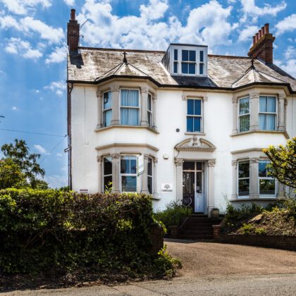
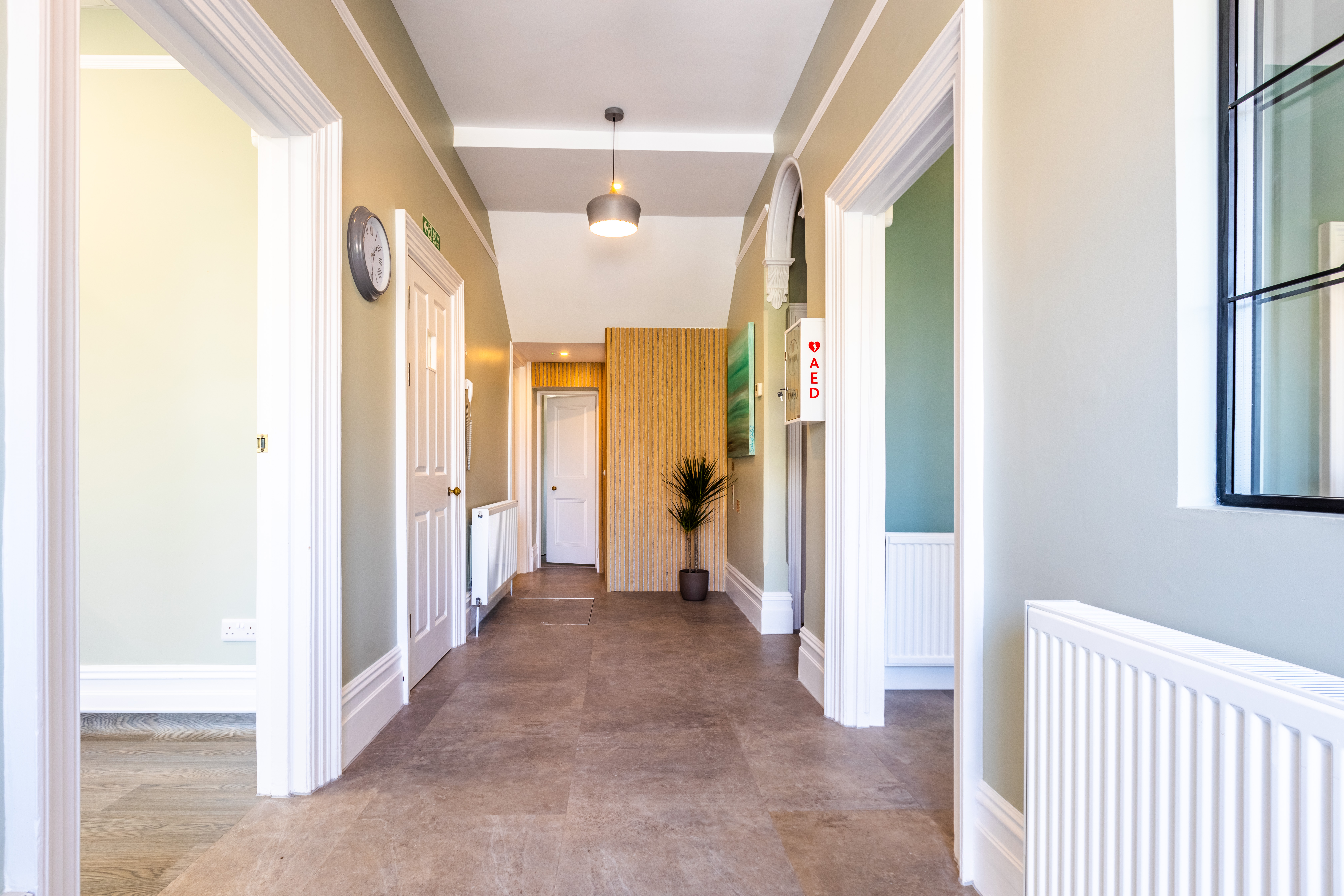
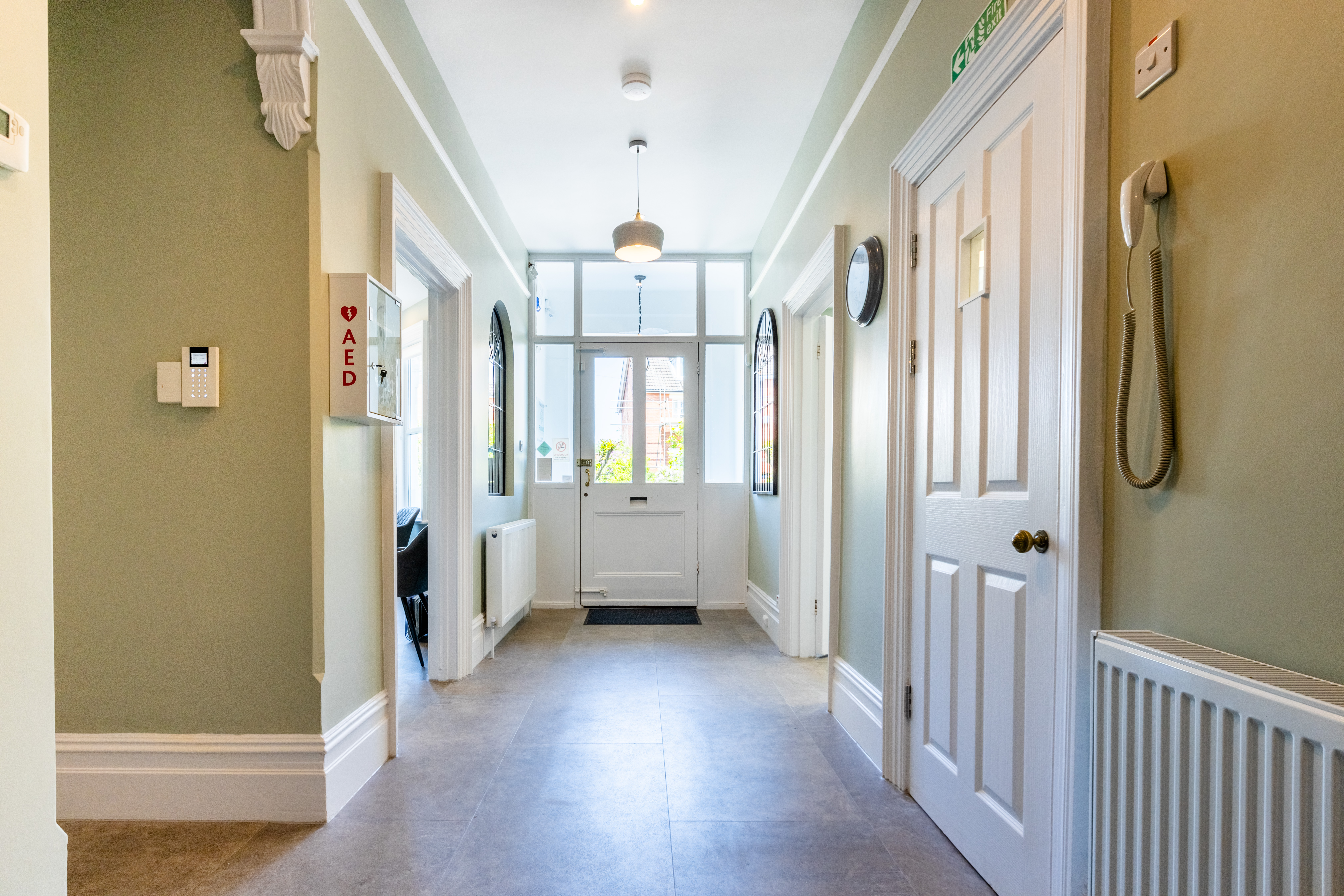
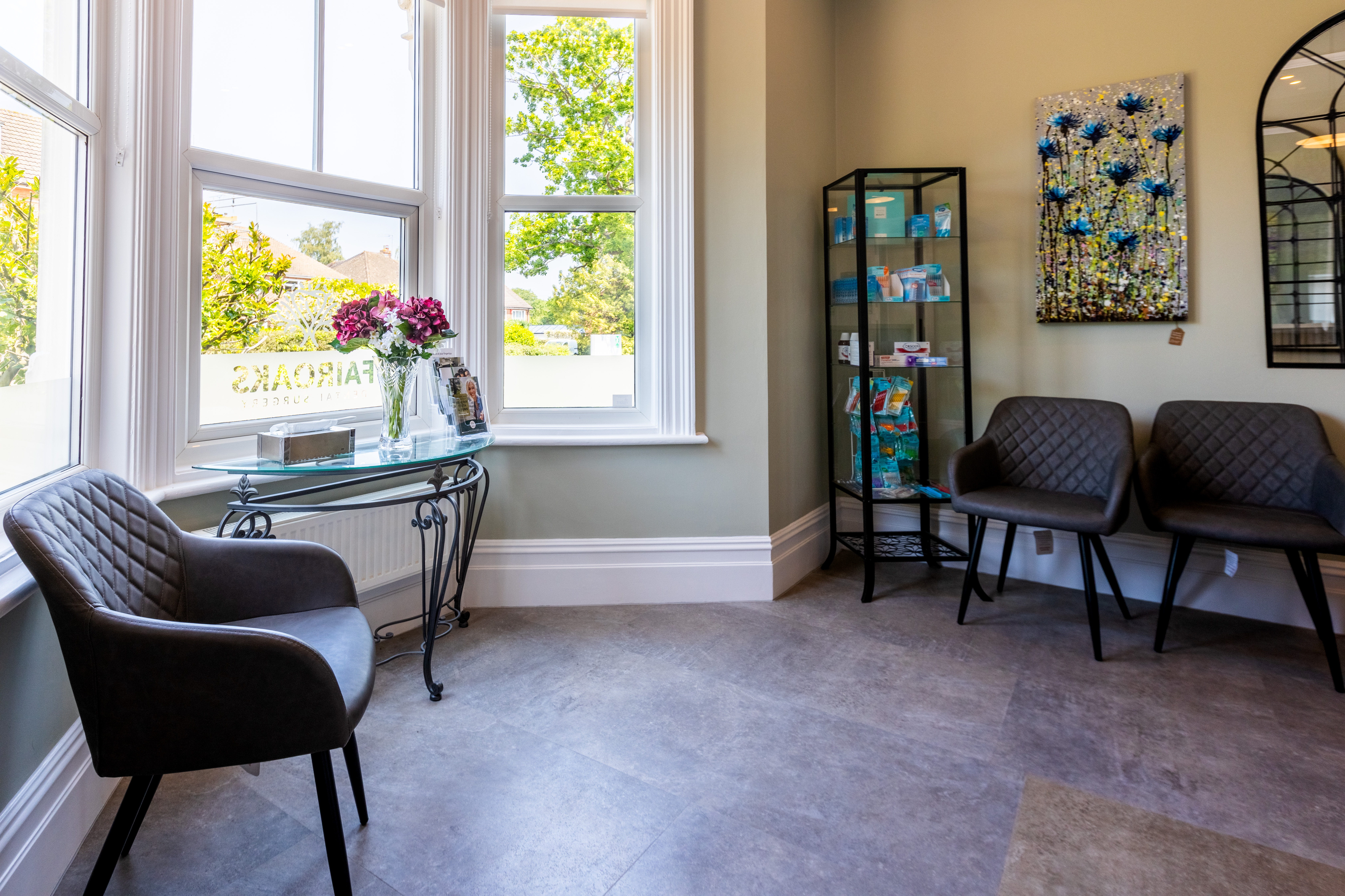
My wife and I were drawn to the Victorian exterior of the building, and we wanted to respect the features, so we didn’t want the interior to be too modern but more of a classic fit-out.
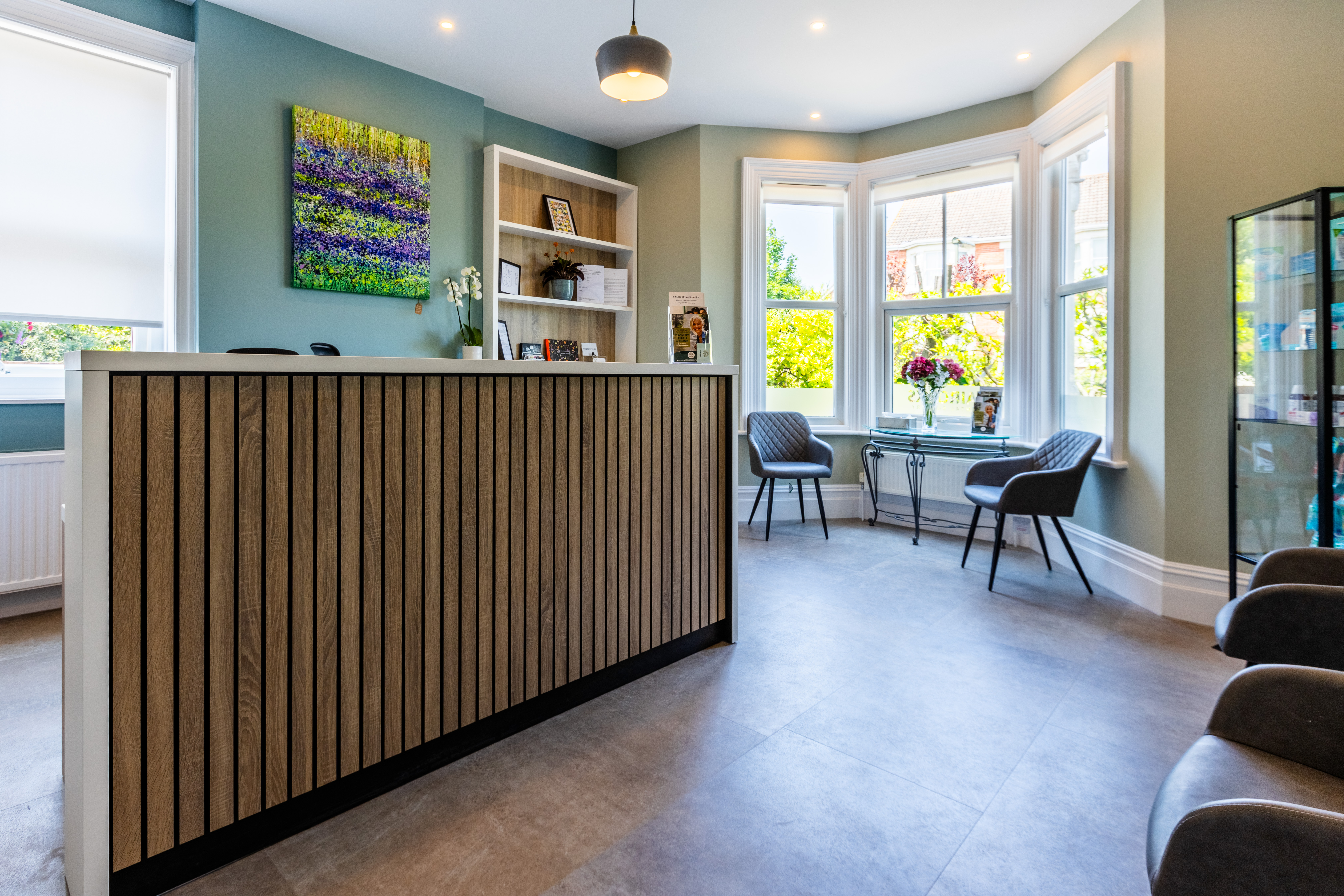
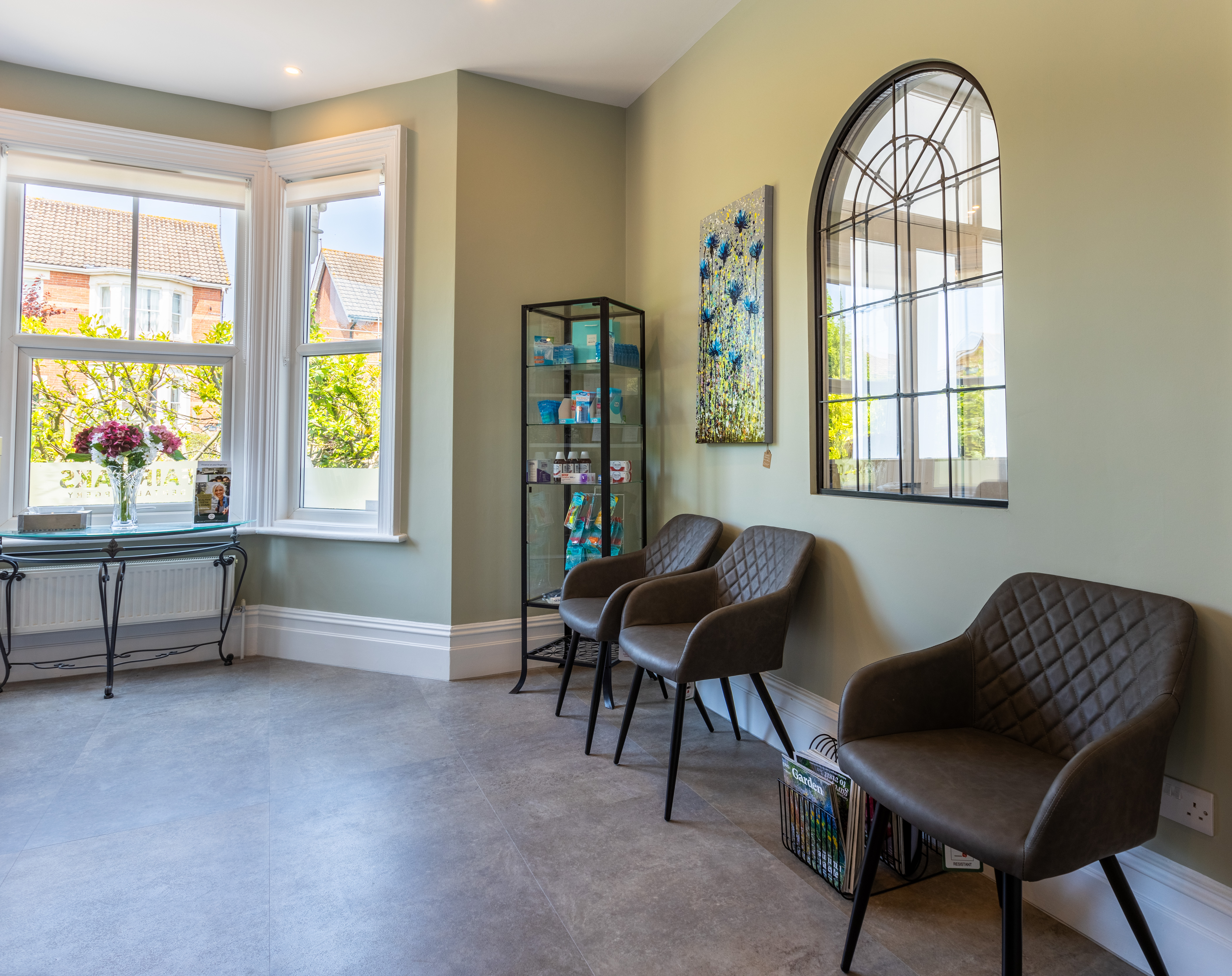
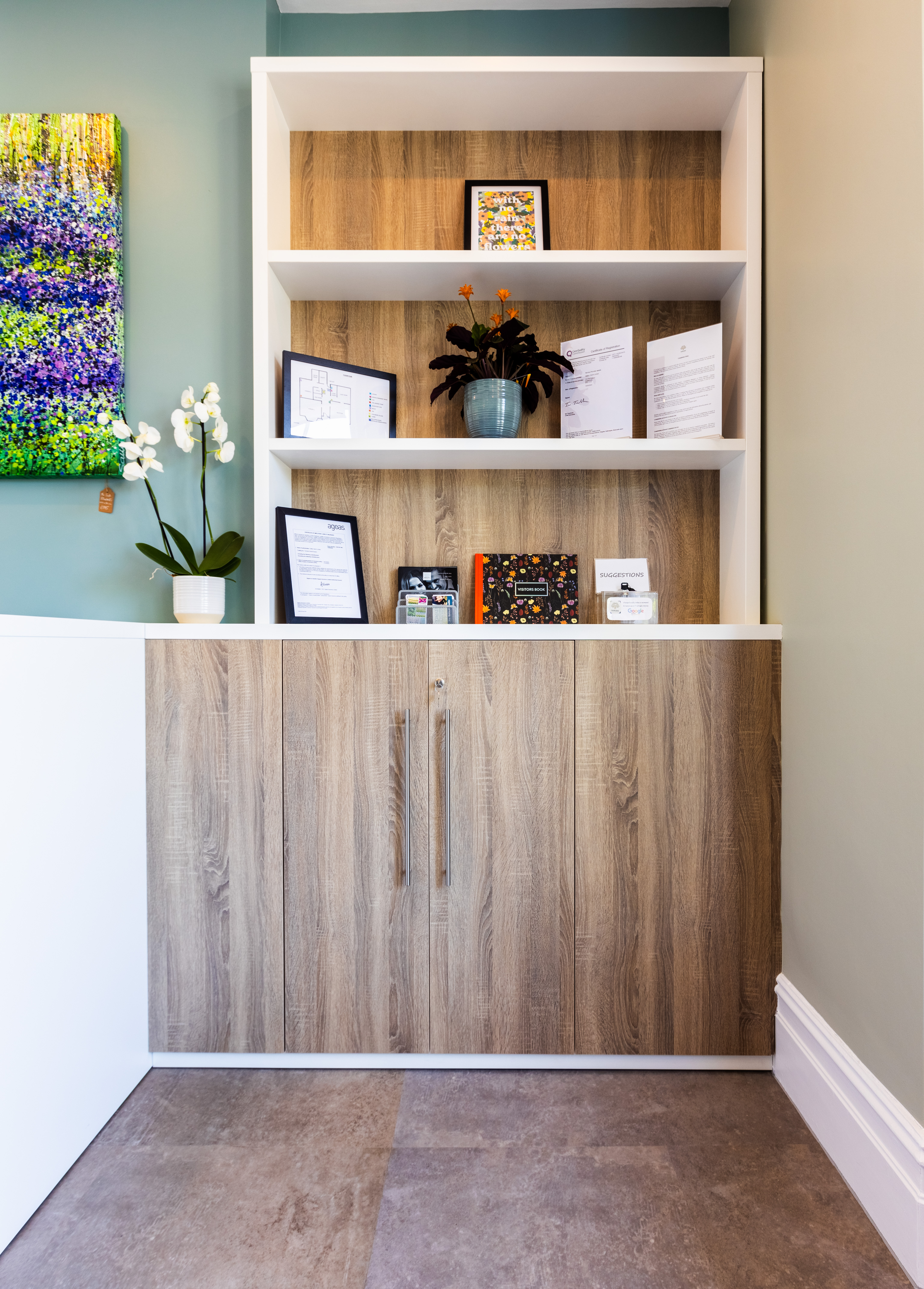
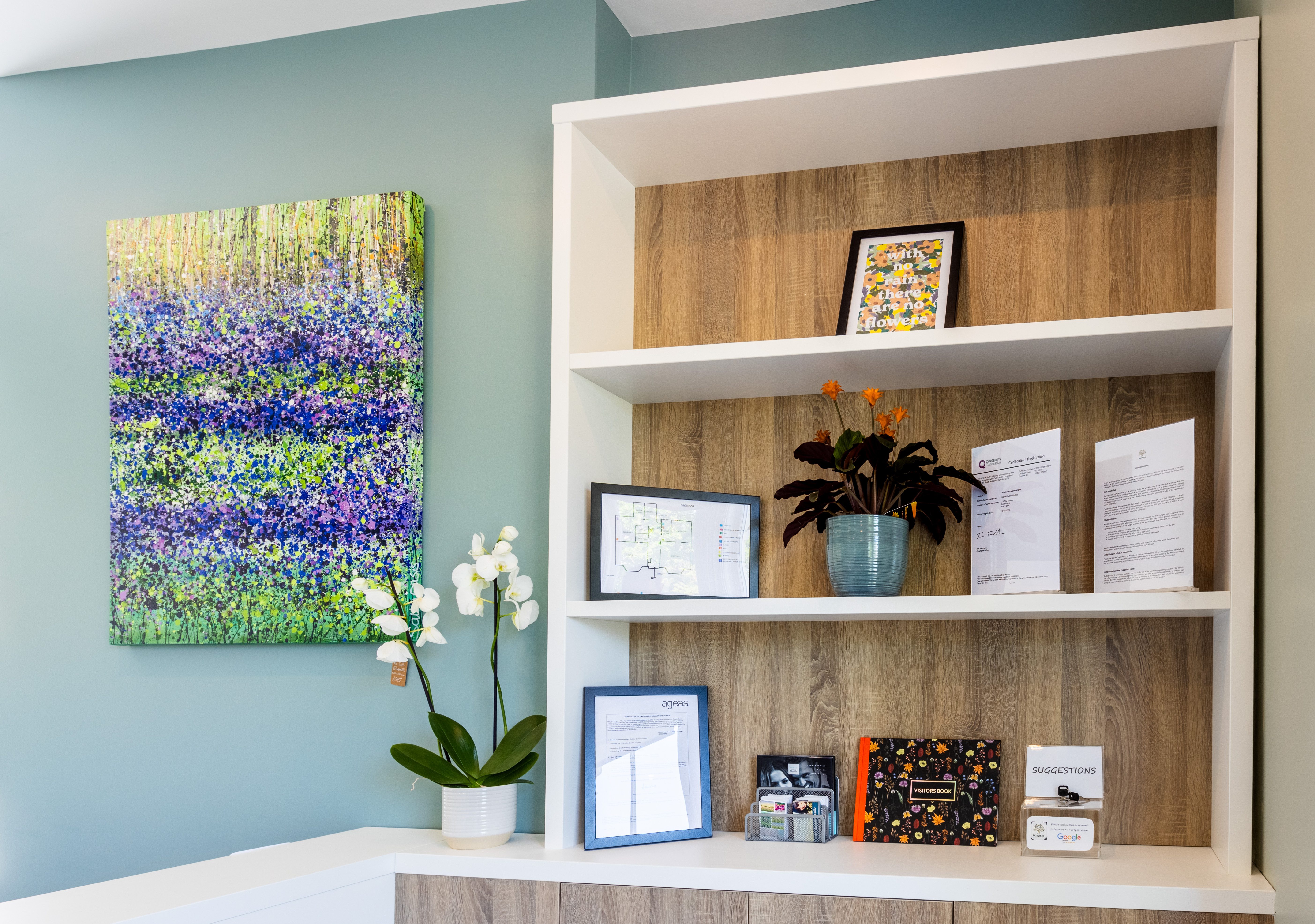
With regard to colour schemes and design, we really didn’t have a clue. Kirsty was great with this. She linked us up with a Pinterest board where we could look at interior options and click on what we liked and then she came up with concept ideas very quickly from that and we were happy with her recommendations and really liked the pastel colours and the wood effects.
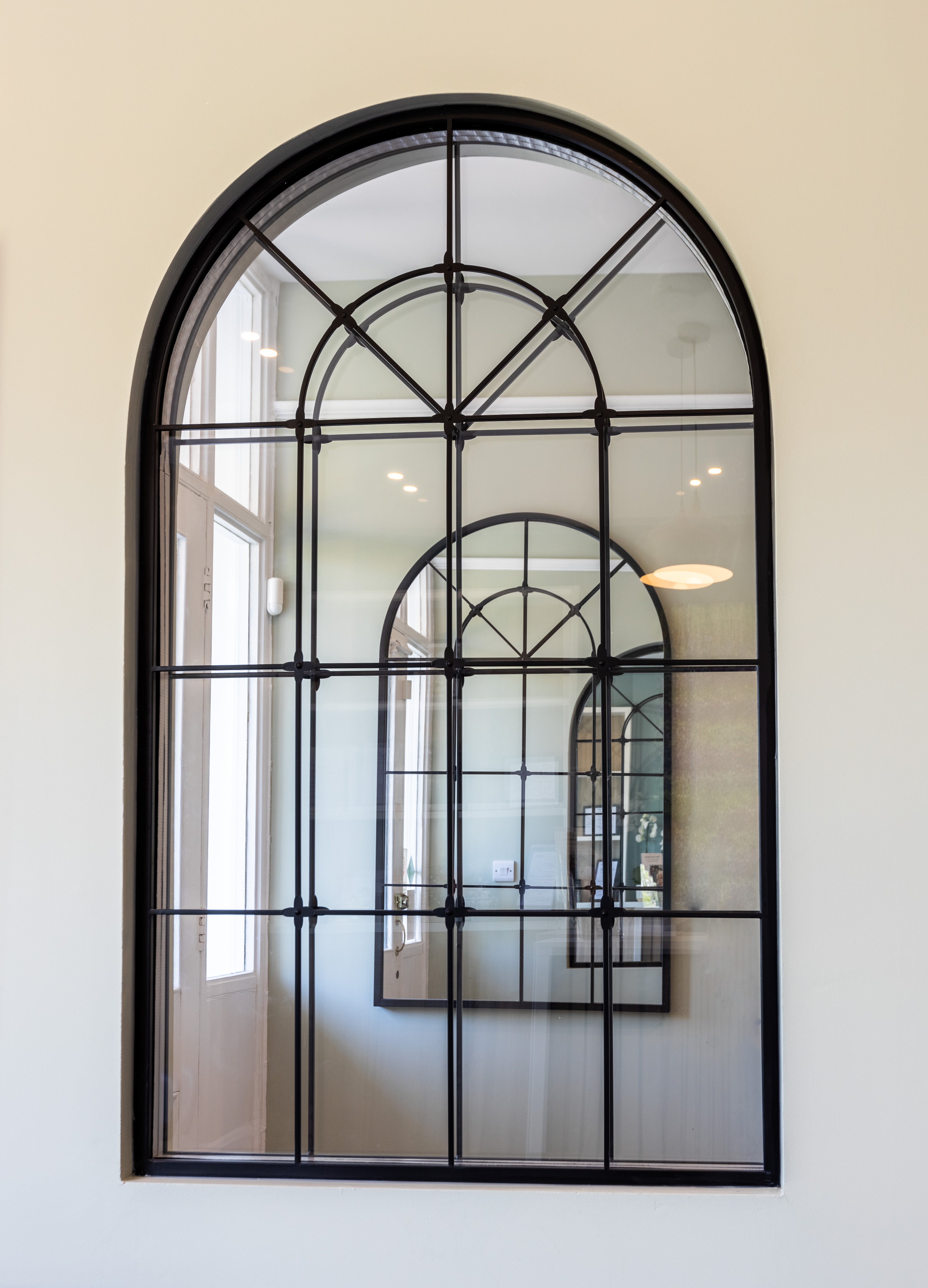
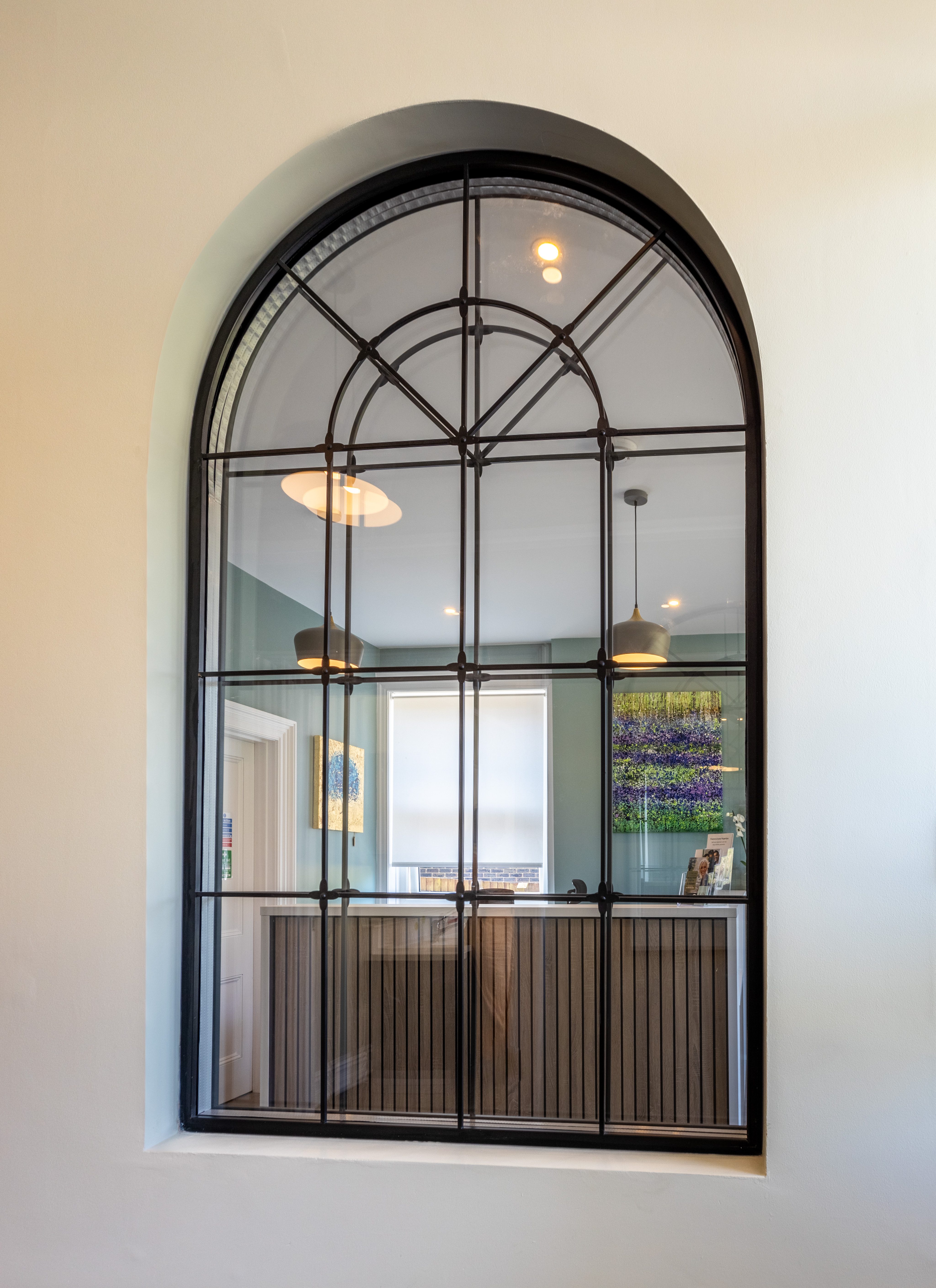
When Kirsty visited the practice, she was really drawn to the old original arch in the hallway, and she said we absolutely must keep that. And at the entrance to the practice, she suggested that we knock through and install a viewing window – I remember thinking I’m not sure about that, but it really works and it’s totally practical.
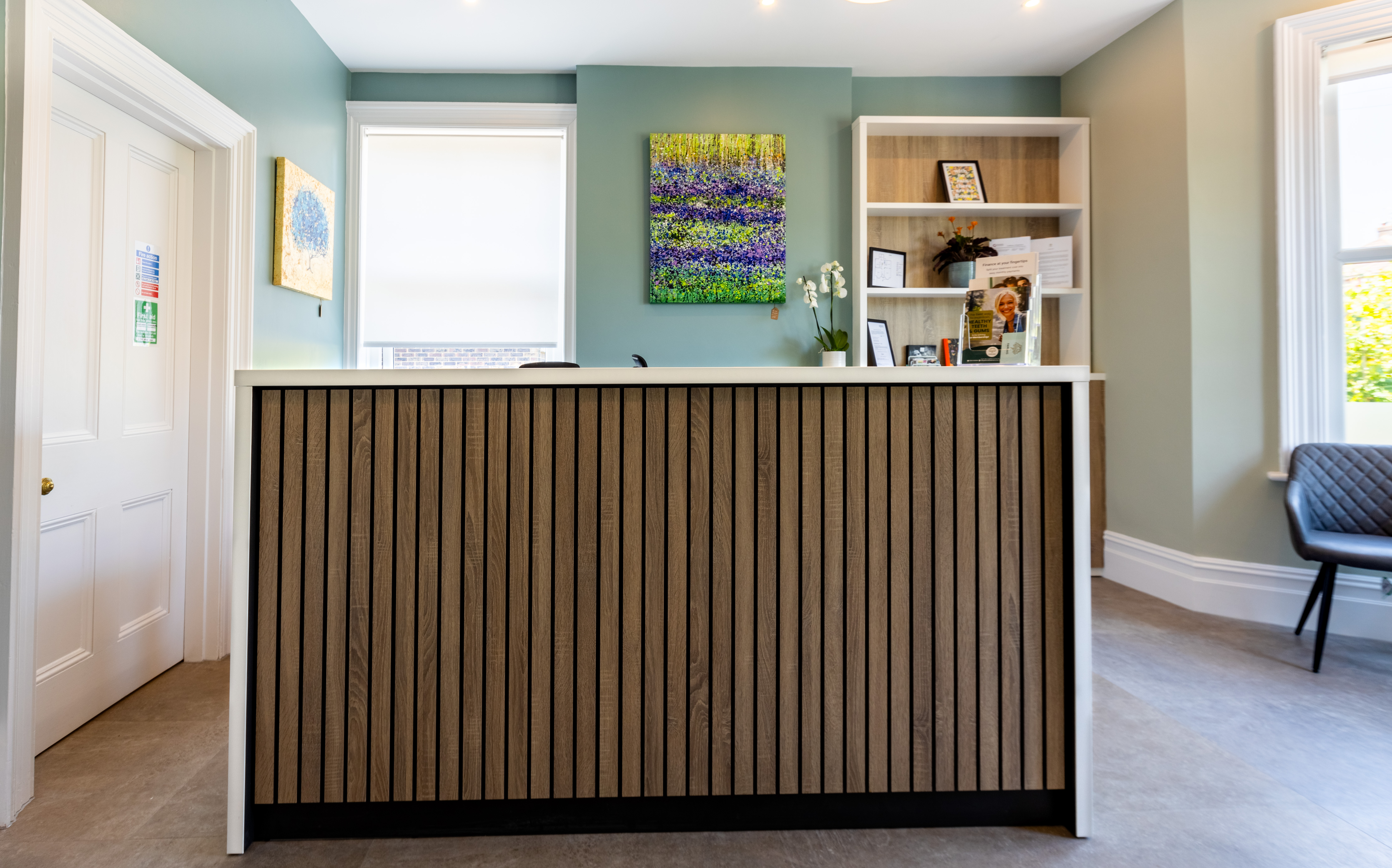
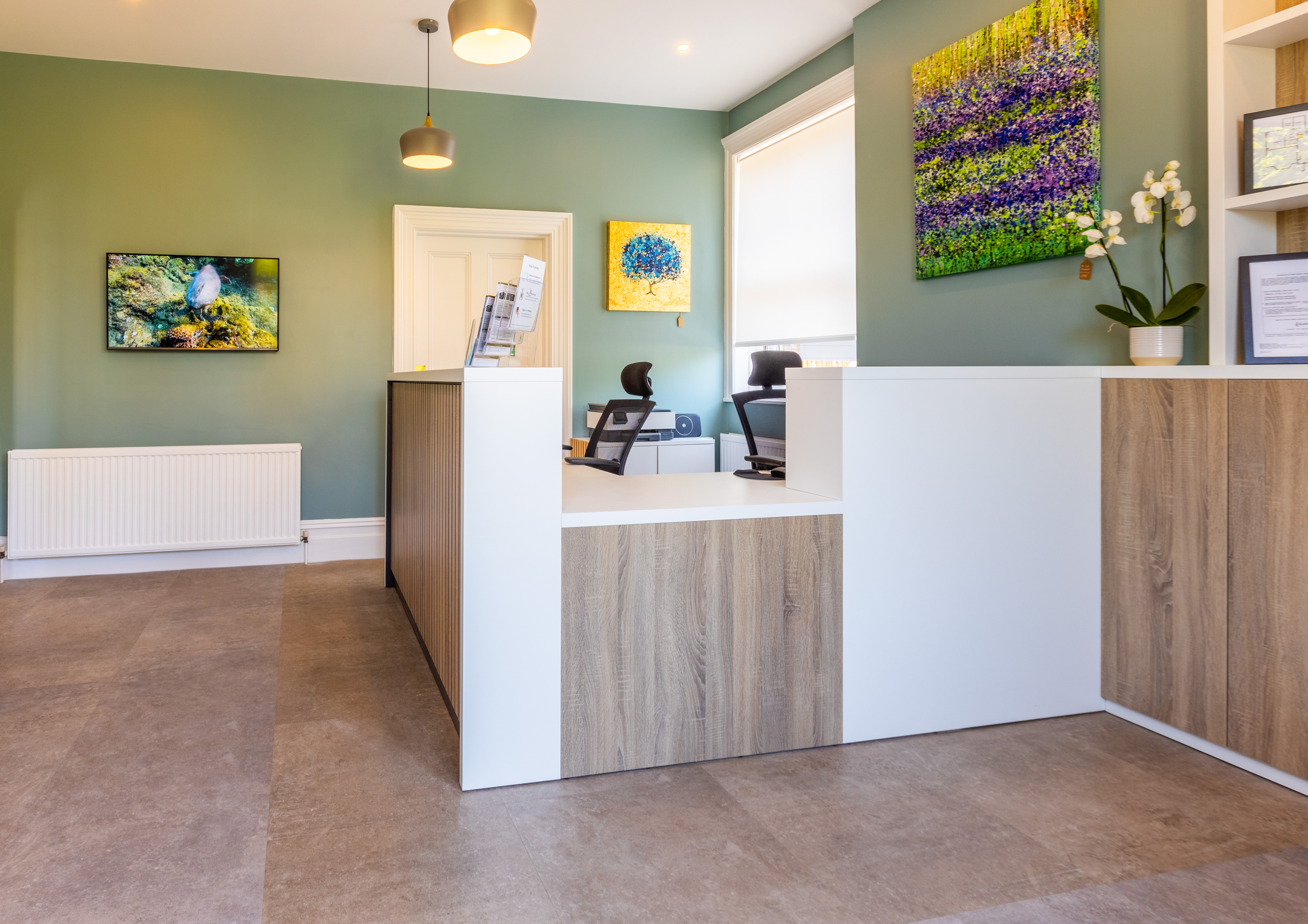
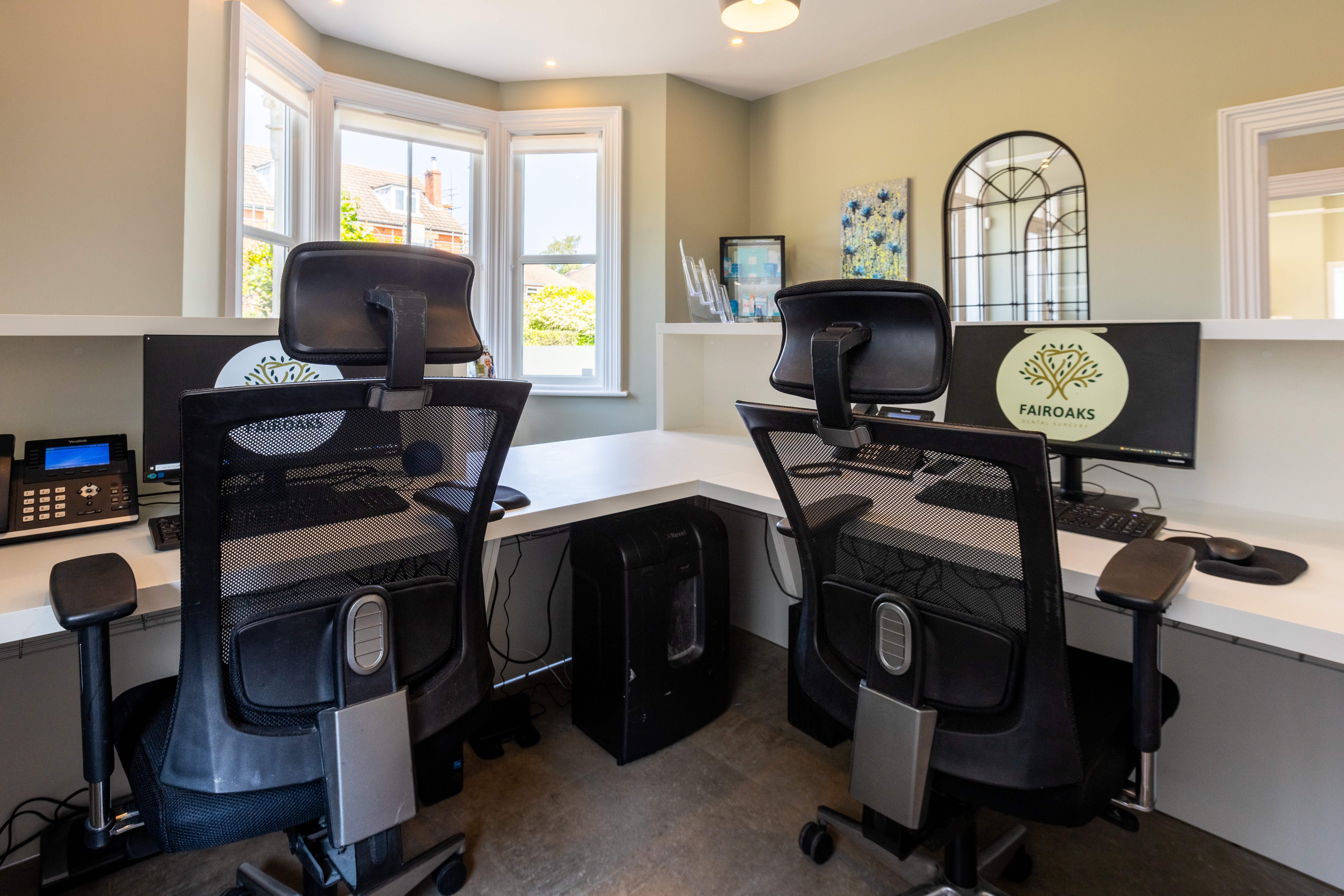
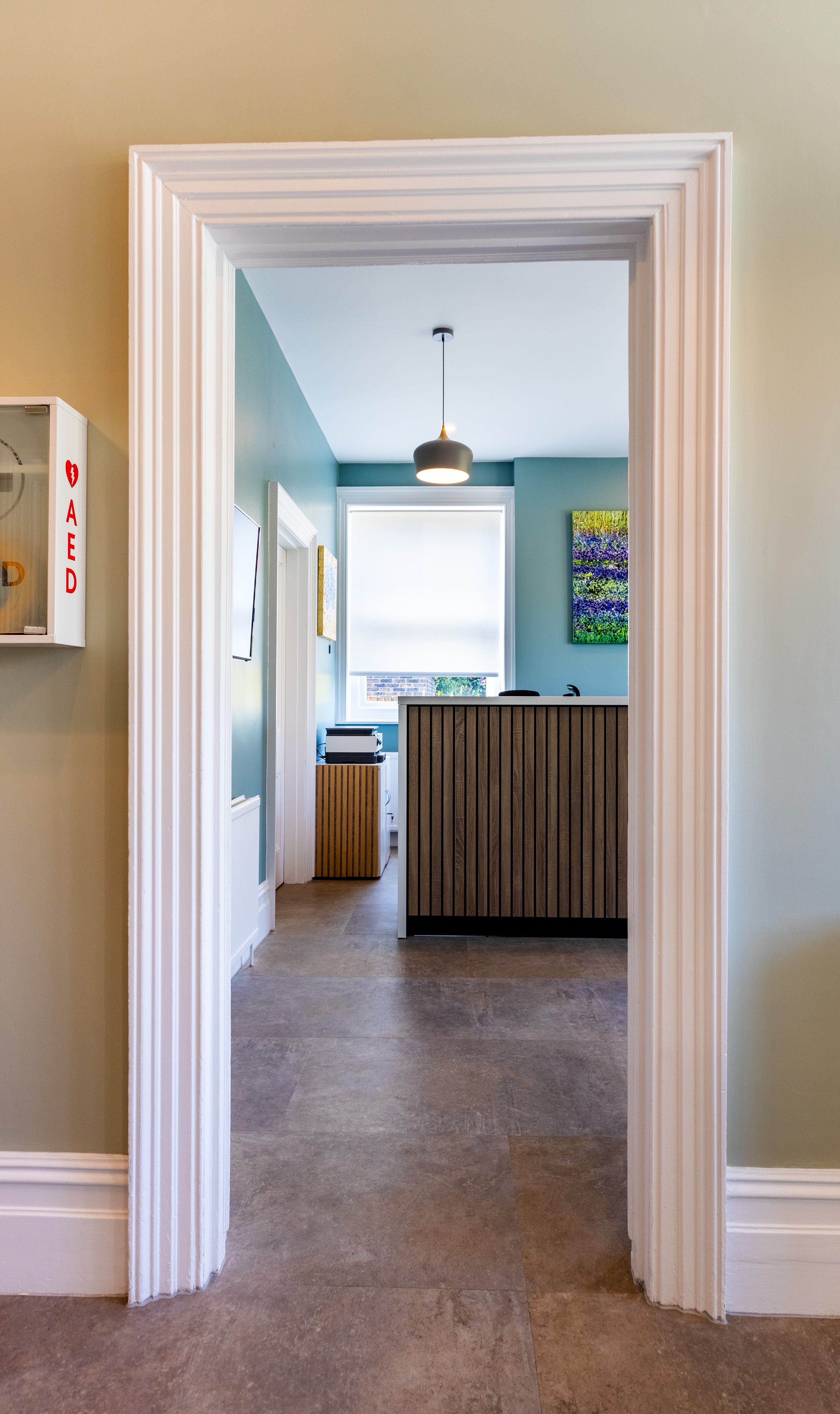
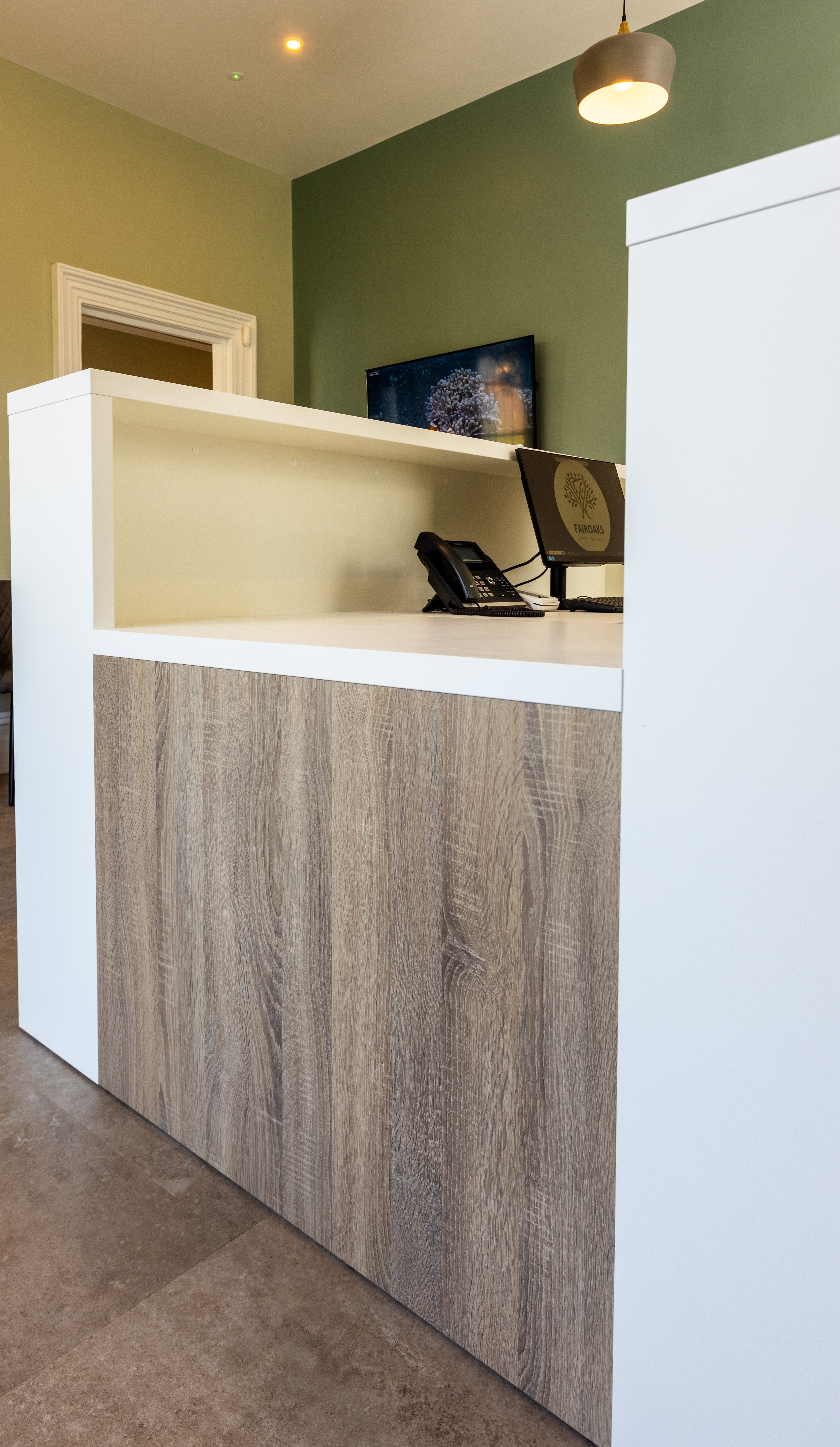
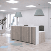
The Stave Reception desk that Kirsty recommended ticks all the boxes, it has all the space we need, and it’s well made, very solid, sturdy, and easy to clean down. In hindsight, I would have increased the built-in wall storage if it didn’t stretch the budget.
Our patients really like the practice interior and colour scheme, and that the design is fresh and up-to-date.
When we first saw Kirsty’s 3D design visualisation, we both instantly loved it. If I had a more generous budget, I would have opened the reception more and made it more open-plan, and then I definitely would have gone with the bench seating that Kirsty recommended.
The kind of building we wanted was important to us – we just loved this building straight away. I’ve always wanted this kind of building with big rooms, big windows, and lots of light.
Top Tips
Before you buy or build a practice, do your research, and scope out the area. Location is a key consideration.
Rewards don’t come without a little bit of risk. You must take a bit of risk sometimes.
Chat to your peers and draw on their experience – if you speak to dentists that have gone through the process there is valuable advice to gain.
It’s better to know from the outset what constraints you’re working towards; set out the budget very clearly, and break everything down.
Timelines may change – the project took a bit longer than initially planned because we found some asbestos. That wasn’t expected, so it pushed the project back by about a month.
CQC inspection: If you’re buying a practice, or building a squat, you must make sure you kick off that process at the right time. If you start too early you may not be ready for the inspection, and if you start too late, you won’t open in time.
